Production - Before printing the publication I had not had a pagination induction. This resulted in the the page orders and the binding settings to be set incorrectly, which caused some of the pages to be printed in the wrong orientation (example of the first print can be seen below). To solve this I watched some online video tutorials and taught myself how to correctly format the pages for print.
The next test print worked out perfectly due to using the 'print booklet' setting in InDesign. This prepared all the pages so that I could print the publication in the same set out order. The final part in the process was to therefore choose the stock and sew the pages together.
In terms of the stock used I chose two fairly light white papers from Fred Aldous. Whilst they felt different, there was no clear visual difference between the two until physically printing the publication. As seen below, one paper printed a lot rougher with less vibrant colours than the other. This was simply down to the grain of the paper. The print on the right was much more suitable as the colours looked more accurate to the actual primary and secondary CMYK colours.
For the last step in the process I printed all the pages on this paper and then went on to sew the publication together with white string. The bookbinding induction provided me with all the knowledge and skills I needed when putting it together.
Final Outcome -
The final printed publication was photographed in a lighting induction. This allowed me to produce really high quality, professional looking images, which I want to keep doing in my practice. The whiteness of the publication contrasts really well against a black background and looks very crisp under a high exposure setting. After adjusting the tone in Adobe Lightroom the final images of the publication can be seen below.

 Evaluation
 -
Seeming as this is the first publication I have ever created I am very happy with the outcome. Study tasks were so important in teaching me how to effectively make the most out of grids and canons. They make the process of designing publications so much easier as you have a structure to work with.
The skills learnt in this brief were taken forward to create the second publication in this module. The fundamentals learnt have provided a crucial basis for other areas of design this year, including the branding projects and wayfinding work. Whilst the design principles themselves are important this first brief gave me a real appreciation of print and publication design. It is an area that I will most likely go down as a career choice.
 Feedback & Evaluation -
For the final stage in the process I presented the leaflet to a small
crit group. Alongside the presentation a sheet was put out with 3 main
questions, asking people specifically about the design. The feedback was
really positive and extremely useful. Despite the crit group not being
the selected target audience age the feedback was important to judge
whether areas of the design are successful or flawed.
Effectiveness & Improvements
The
first question that I asked was ‘is the design effective for the target
audience? If so why?’ Some of the points that I received were:
'Yes, because it’s not information heavy so, if you aren’t tech savvy, you can understand it'.
'Yes, the colour scheme works really well'.
‘It’s engaging for the audience you’ve aimed it at because their children is a priority to them.’
'It's good that you only put "is your child safe" as it puts stress on the importance of safety'.
'Yes, you can definitely tell that it's for adults and not for children'.
All
the feedback suggested that the style of the design suited the target
audience of parents; however, to fully judge this I would have to
receive feedback from parents themselves. Alongside this question I
directly asked people whether the leaflet appealed to them. It was
interesting to find out whether the leaflet style appeals to my age
group, as some parents can be as young or younger than 18-20. The
majority of people said that they liked the style; however obviously
they would not look at the message because they don't have children.
The
second question asked was 'do you think that the distribution method is
an effective idea? If so why?' This received a majority of positive
feedback; however there were some comments on improvements that could be
made:
‘Yes, it would be easy to distribute and wouldn’t cost a lot as it's single sided.’
‘Yes, the Government could easily fund it if they went along with the campaign'.
‘Yes. you could also distribute it in places where parents and children go - e.g. libraries, schools, hospitals etc.’
‘Yes,
you could possibly reduce the design to a 3 colour print so that the
overall production is cheaper. Although, this wouldn’t make a big
difference.’
The comment about distributing the leaflets at
places such as schools could be a good way to reduce costs, as large
boxes of the leaflets could be sent out alongside creating less
envelopes. If this did happen, the government logo would have to be
placed somewhere on the leaflet, as opposed to on the envelope.
The
third and final question asked was 'what improvements/changes would you
make, if any, and why?' All the feedback was very positive and
complementary about the design. A few specific points made however were:
'Possibly include more pictograms on the second poster page
to break up the text a little more. For example, make some pictograms to
illustrate the 8 preventions'.
'You could try using the selective style used for the facts in the body text'.
I
did attempt placing more pictograms with the body text on the 2nd page;
however, keeping legibility was difficult when trying to fit all the
information and pictograms into the folded areas. If I developed the
leaflet further I would definitely get the feedback of parents first
before adjusting the design. If they felt that the body text was not
engaging enough I could play with the layout and introduce new
pictograms/illustrations.
Overall, similar to Studio Brief 01,
this brief pushed my design skills even further as I had to explore
layout design and print - which I have not had much experience in
before. The InDesign workshops taught me a lot about how to set up
documents for print and the print study tasks with Danny provided
knowledge of print design that I was ablte to apply. The feedback
received suggests that the leaflet is successful in warning the target
audience about the dangers of online social networking and the threat it
poses to their children. An 18-20 year old's opinion is most likely
different to one of a parent; however, I can assume from received
comments that the style of the leaflet is suitable for the selected
audience.

Final Outcomes - The outcomes for this brief consist of the final leaflet and the envelopes. As 'find out more at www.gov.uk' was written on the back side of the leaflet I created a mock-up page for the Government's website. A screenshot of their current site layout can be seen to the right. The concept behind the page was that once it loads, the initial, front page graphic would appear. A 'learn more' button would be click-able to the side of the text. This would transition to a page with all the information about child abduction, preventions, contact numbers and the sources used in the leaflet. I tried to keep the aesthetic of the leaflet's front cover and simply place the gov.uk logo as a watermark in the corner of the page. The red and grey division did not work with the 'learn more' symbol, therefore I simplified the web design to just black, white and grey for more simplicity and clarity. The outcomes can be seen on the following pages.

Further Development - In 2014 there were around 8 million families with dependent children in the UK (taken from www.gov.uk). This is a huge number of households, therefore a mass printing method would have to be used in order to produce a leaflet for each household. In the first group crit I found out that I would have to research into printing methods, as some can be very expensive.
Flexography is great for producing a high volume of runs as it is fairly cheap for high volume printing; however, it has been replaced by a radical new printing method named rotogravure. It is suitable for the distribution of this leaflet because of the following aspects:
• It is the fastest and widest press in operation, being able to print 14m per second and more.
• The printing cylinders can last through large-volume runs without the image degrading
• The image reproduction is very high in quality.
• Low ink consumption and CMYK printing can be done.
• High volume production allows low per-unit running costs.
As agreed earlier in the crit group fairly light, newspaper-esque stock would be used for the leaflet. Unfortunately anything below 70gsm is too thin and badly absorbs the ink in laser printers. Although, it could be used in rotogravure printing. To test out different paper weights I experimented with different G.F Smith stock - a 270gsm Colourplan in pristine white, a 135gsm Colourplan in natural and a 135gsm Colourplan in pristine white.

The 270gsm Colourplan was too thick when being printed through the rollers. The red ink printed with a purple tone and the leaflet was difficult to fold up due to the thick pages. The colours were also much less vibrant and, overall, not as effective as the other prints. For this reason, 270gsm was ruled out of the stocks to be used.

The 135gsm Colourplan prints in natural and pristine white were much better in terms of the print colour. The reds in both came out really clearly in comparison the the 270gsm paper. The natural paper does slightly link to the off-white colours used in Swiss design; however, the pristine white paper works better as it keeps that innocent, white colour that is key to the colour scheme.
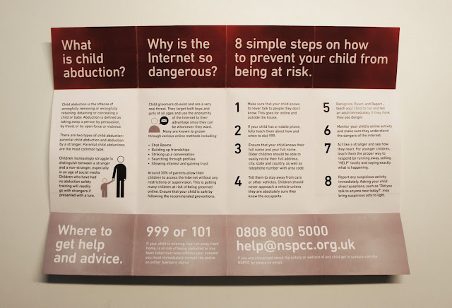
Whilst the stock quality and print detail was at a high level there were still issues with the leaflet. Firstly, the paper weight was still too high as the leaflet was difficult to fold up. Yet, the more frustrating aspect was that the ink has transferred to the white part of the page when folded. This leaves inconsistent red marks on the page that ruin the aesthetic.
 To try and fix this I had to sacrifice the G.F Smith stock and use a thinner, 100gsm piece of paper. Coated papers are more sensitive to cracking than uncoated papers, therefore an uncoated paper was used. As seen below the fold lines did not crack at all and the ink did not transfer as badly to the white area. The crackles and ink transfers could easily be prevented in the actual rotogravure production of the leaflet due to the ability to score lines and to use thinner stock and different inks. The leaflet was able to fold up with ease and the finish of the paper felt very smooth.


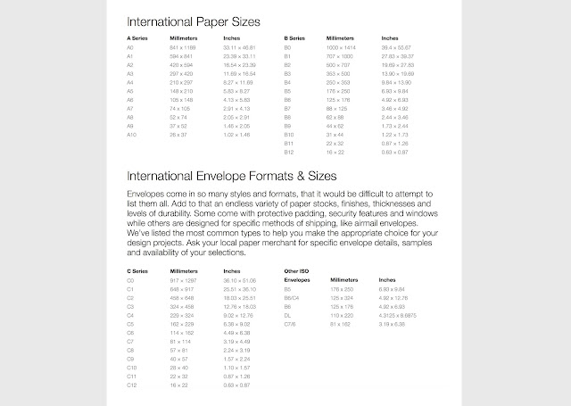
 The next stage in the process was to consider the distribution of leaflets in terms of how it would be sent out to households. The fastest and cheapest method to distribute millions of leaflets would be in an envelope through the post. The size of the leaflet is just under A5 when folded up, therefore an appropriately sized envelop had to be found. By considering the sizes of international envelopes (list seen below) the most appropriate envelope was the C5 format, which is 162mm x 229mm. A5 is 148 x 210mm, therefore it would perfectly inside a C5 envelope.


There are various different envelope types to choose from. As discussed in an earlier crit, the envelope should be a little more intriguing than just a plain white piece of paper. Various people suggested using a red envelope to go with the leaflet colour scheme and grab people's attention. Taking these points into account I opted for a red, C5 envelope. World of Envelopes are a huge distributor of envelopes. By looking at their specifically sized red C5 envelopes I was able to find 3 appropriate envelopes. The colour of the centre envelope is dull and would not catch the users eye, whilst the envelope to the right is more vibrant than the red colour in the leaflet. The envelope on the left is the most suitable as it strongly links to the reds in the leaflet, it is the correct size needed and is also cheap at £0.16p per 1000+ (this would be much lower when purchasing millions).
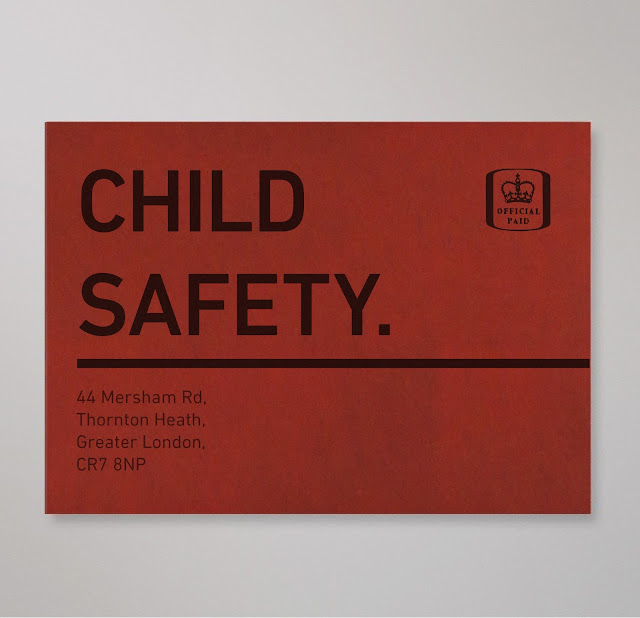
 Unfortunately, envelopes are too thick to print on on the university printers. Therefore, to visualize how the envelope would look I made a few mockups in Photoshop. Rather than a typical envelope layout, like the one seen on the left, I tried to make the aesthetic much bolder and engaging. A stamp had to be placed on the top right to ensure that it would be posted, whereas I was able to freely move about the address and other elements.
The most direct way to grab a parent's attention was to detail what is inside the leaflet. On the front side of the envelope I placed the text CHILD SAFETY in the same typeface and point size that is used in the leaflet. These two words are short, concise and instantly attention-grabbing. The line below the text has been used to draw users into turning the envelope over. This will improve the chances of them opening the envelope and to read the leaflet. The address was placed on the envelope to ensure it would be posted by the postal services.


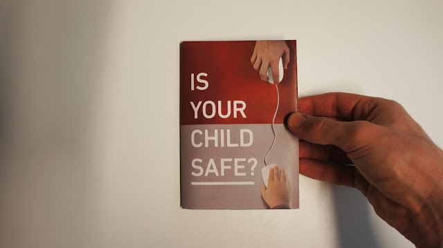
The back side follows a similar aesthetic to the front side of the envelope. The two words OPEN ME have also been used to push parents into opening the envelope and engaging with the content inside. The continued line from the front page has been extended to underline this text and drive the opening of the envelope even further. The leaflet would placed in the envelope as seen below. This would allow the front page title to be read easily when taking the leaflet out of the envelope. The contrast between the black text on the envelope and the white text on the leaflet is very high. This difference in aesthetic should intrigue users to fully engage with the leaflet.


