Flexography is great for producing a high volume of runs as it is fairly cheap for high volume printing; however, it has been replaced by a radical new printing method named rotogravure. It is suitable for the distribution of this leaflet because of the following aspects:
• It is the fastest and widest press in operation, being able to print 14m per second and more.
• The printing cylinders can last through large-volume runs without the image degrading
• The image reproduction is very high in quality.
• Low ink consumption and CMYK printing can be done.
• High volume production allows low per-unit running costs.
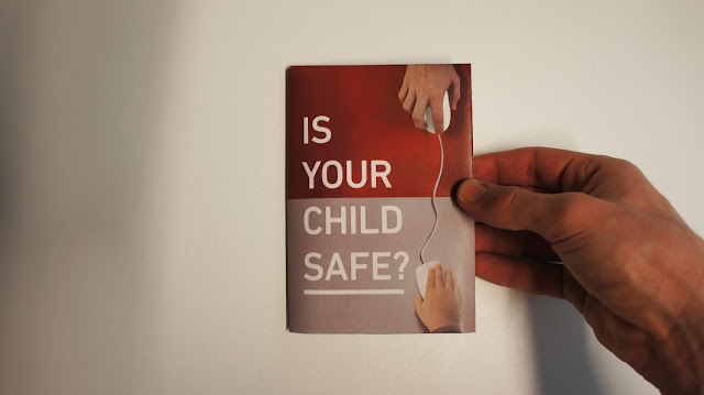
As agreed earlier in the crit group fairly light, newspaper-esque stock would be used for the leaflet. Unfortunately anything below 70gsm is too thin and badly absorbs the ink in laser printers. Although, it could be used in rotogravure printing. To test out different paper weights I experimented with different G.F Smith stock - a 270gsm Colourplan in pristine white, a 135gsm Colourplan in natural and a 135gsm Colourplan in pristine white.

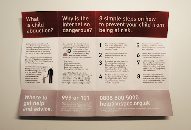
Whilst the stock quality and print detail was at a high level there were still issues with the leaflet. Firstly, the paper weight was still too high as the leaflet was difficult to fold up. Yet, the more frustrating aspect was that the ink has transferred to the white part of the page when folded. This leaves inconsistent red marks on the page that ruin the aesthetic.
 To try and fix this I had to sacrifice the G.F Smith stock and use a thinner, 100gsm piece of paper. Coated papers are more sensitive to cracking than uncoated papers, therefore an uncoated paper was used. As seen below the fold lines did not crack at all and the ink did not transfer as badly to the white area. The crackles and ink transfers could easily be prevented in the actual rotogravure production of the leaflet due to the ability to score lines and to use thinner stock and different inks. The leaflet was able to fold up with ease and the finish of the paper felt very smooth.
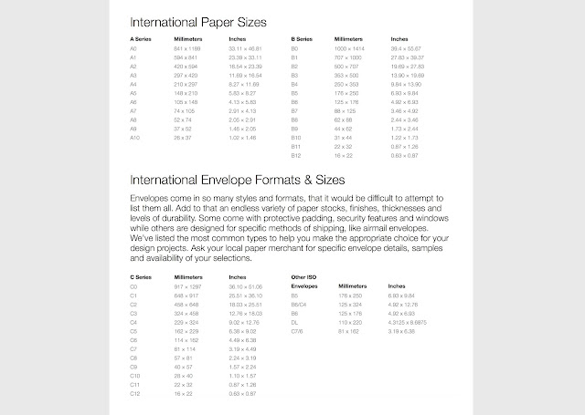
The next stage in the process was to consider the distribution of leaflets in terms of how it would be sent out to households. The fastest and cheapest method to distribute millions of leaflets would be in an envelope through the post. The size of the leaflet is just under A5 when folded up, therefore an appropriately sized envelop had to be found. By considering the sizes of international envelopes (list seen below) the most appropriate envelope was the C5 format, which is 162mm x 229mm. A5 is 148 x 210mm, therefore it would perfectly inside a C5 envelope.
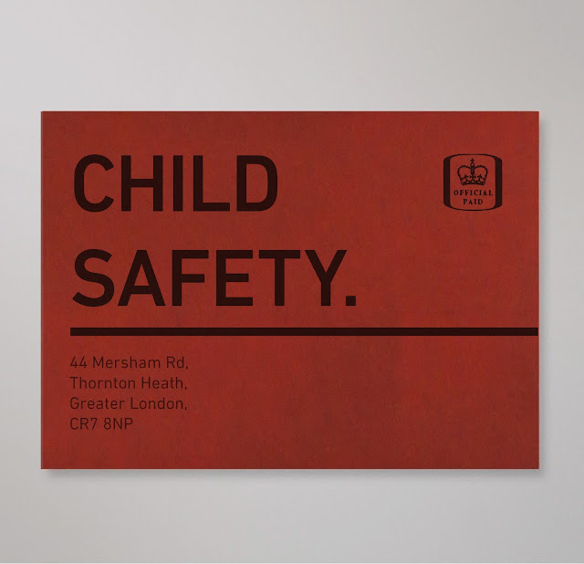
 Unfortunately, envelopes are too thick to print on on the university printers. Therefore, to visualize how the envelope would look I made a few mockups in Photoshop. Rather than a typical envelope layout, like the one seen on the left, I tried to make the aesthetic much bolder and engaging. A stamp had to be placed on the top right to ensure that it would be posted, whereas I was able to freely move about the address and other elements.
The most direct way to grab a parent's attention was to detail what is inside the leaflet. On the front side of the envelope I placed the text CHILD SAFETY in the same typeface and point size that is used in the leaflet. These two words are short, concise and instantly attention-grabbing. The line below the text has been used to draw users into turning the envelope over. This will improve the chances of them opening the envelope and to read the leaflet. The address was placed on the envelope to ensure it would be posted by the postal services.


No comments:
Post a Comment