Thursday, December 29, 2016

OUGD503 - Studio Brief 01 - Minor Brief #1 - Feedback & Mockup Production


As I set myself a very short time-scale for this brief, mockups of the final packaging bars were made in Photoshop, as opposed to being physically made. The mockup style taken really needed to be considered, as low-quality, unrealistic mockups would not suit the required luxury aesthetic set in the brief. Rather than getting feedback on the designs themselves, I took 3 unpopular entries that have already been submitted to this brief, as well as 3 of the most popular entries, and asked a crit group to give me feedback on which they think is more luxurious/why the bottom 3 submissions are more popular.

The feedback was very clear. People firstly highlighted how the unpopular mockups do not look realistic, as the perspective and backgrounds used are very digital and do not create the aesthetic that the bar is physically in an environment. Further feedback given highlighted that the popular designs use single colour backgrounds, which puts more of a focus on the bar designs than their surroundings. Overall, people most preferred the bottom left entry, as the subtle background gradient and drop shadows used create the illusion of depth and three-dimension - making the mockup look very realistic. People suggested that I keep my mockups as simple as possible, with just one background colour. Furthermore, it was suggested that I should use shadows, highlights and lighting effects in Photoshop to make the mockups appear as realistic as possible.


Further research was made into luxurious bars. Below are some examples found on Behance. Whilst these are bars that have been physically made, they are all very similar to the popular entries, in terms of the aspects highlighted in the crit.


Informed by this feedback I researched into some downloadable mockups online. Whilst I could have photographed my own mockups, it was much less time-consuming to buy already-made Photoshop mockup which have included shadow, highlight and light layers. The most professional, luxurious looking mockup that I could find can be seen below to the right. This cost just £10, and includes a variety of real paper backgrounds, lighting effects and angle variations.


In terms of producing the mockups, designs were simply imported into clipping masks, which were included in the Photoshop files. This quickly and accurately placed my designs, made in the digital development stage, onto the bars. A grey background was used for all the mockups to keep consistency and simplicity across all the outcomes produced. Some further Photoshop work had to be done in the respect of aesthetically showing different stocks/finished; however, use of the clipping masks made this very simple to achieve. Whilst the production timescale of creating mockups was very quick, a lot of time in this part of the project was spent on actually finding the right mockups to use - there are a huge range available online, therefore it was challenging to find a suitable one to use. The outcomes produced can be seen in the following blog post.

OUGD504 - SB2 - Design for Screen - Outcomes, Final Crit & Evaluation


Short Amazon Prime Ad:


Amazon Site Rebrand Walkthrough:


Mockups:


I am extremely pleased with the outcomes produced in this project. Despite the videos taking a very long time to produce, I feel confident that they could be pitched professionally to the Amazon branding and marketing team. Not a lot of research was made into using a developer because I would not be working with one if the pitch was accepted. Instead, I would be pitching the idea straight to Amazon, who would then take the concept forward with their own team of developers.

The main aim of this project was to improve the marketing and user experience of Amazon - Prime in particular. To see whether other people thought that I had made an improvement to the existing platform/marketing and solved the problems identified, a final crit was arranged to gain some final feedback. All the feedback was extremely positive and indicated that the outcomes produced are successful in terms of solving the problems identified. It was great to hear that people thought the overall platform had been developed in a much clearer manner than the existing Amazon site. A lot of people were surprised by the Prime ad about all its features, which was good to see, as it highlights how the ad is fulfilling its purpose in highlights all of Prime's areas - not just the one-day delivery.

Overall, the feedback was all very positive. There were only one or two improvement suggestions, which I would consider if I was to further improve the outcomes. For the advert, it was suggested that the 'Amazon Prime' text should be only revealed at the end, to tease people with all the features and surprise them once the video is finished. This is one aspect that I had not considered; I went more for the approach of educating people about the features of Prime in the first 10 seconds, to ensure that the link to Prime was made. Both could be created and tested, to see what people prefer. For the walkthrough video, another suggestion was made to use icons for the Prime features page. As I was trying to keep with the type aesthetic, this was not an option I had thought of; however, it could make the individual platform areas more identifiable. Both points are really strong ideas that I would definitely experiment with if I choose to extend this project.

As a whole, this project was a real challenge. I have done motion graphics before, therefore was fairly experienced when animating the video; however, I have never had to record my own vocals and edit them to suit the video. Amazon was a very difficult site to choose, mainly because it is already hugely successful, with over 300 million users worldwide. In this sense, I wanted to pick such a demanding task to push an outcome that I would not usually attempt. Whilst I thoroughly enjoyed this project, it has made me realise that motion graphics is not a career path that I want to pursue. The walkthrough video was very time consuming and tedious to make, as After Effects requires a lot of attention to detail. Branding and web design are are aspects that I going to definitely pursue however.


Sunday, December 25, 2016

OUGD503 - Studio Brief 01 - Minor Brief #1 - Digital Development


After receiving feedback on the various sketched ideas, 3 main digital concepts were developed. These were informed entirely by the research made, with careful consideration made in terms of the imagery, typography, materials and overall compositions.


Idea 1 - It was found in the research stages that black is a luxurious colour. Whilst many luxury brands use black, it was also found that younger audiences are attracted to brighter hues. As the target audience for this project is 'young professionals', where the product will be placed in 'high-end delis, gift shops and gourmet food fairs', a balance essentially needs to be made between bright and dark elements, as potential consumers in such shops will be young and slightly older. As a starting point, an off-black background was used to slightly hint at this luxury aspect.

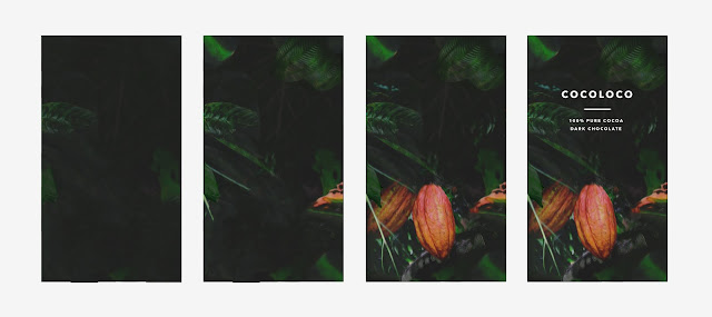
As the brief asked for designs to revolve around the origins of cocoa, the most obvious visual response to take was to incorporate imagery of the cocoa plant, and its environment, into the packaging. When looking at images of rainforests, one clear visual aspect that was noticed is the significance of depth; leaves and plants all overlap and cover different fields of space. To try and recreate this natural aesthetic, images collected of cocoa trees were cut out and layered in Photoshop at different opacities. This pushed some elements further back, and brought others to the foreground - the cocoa plant being the main visual focus of the piece. The green and orange colour of leaves and trees are quite bright and contrast strongly with the black background. This creates a fairly balanced composition that has dark and bright hues - appealing to the target audience specified for this idea. The combination of images can be seen below.


In terms of the typography, there were no specific client requirements; however, the client did ask for a modern approach to be taken. Looking at the style inspiration images included with the brief, the majority of packaging designs use sans-serif typefaces.

To find a typeface that fits the modern, luxury aesthetic requested, research was made into various typefaces. One sans-serif typeface that stood out is Avenir Next Bold. Frutiger, the creator, describes Avenir as 'a clear and clean representation of modern typographical trends, giving the designer a typeface which is strictly modern and at the same time humane, ie suitable refined and elegant'. The typeface is clear to very legible at a small point size, has even x-heights and is very modern. For these reasons, it was incorporated into this idea.


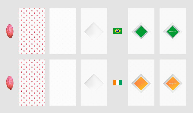
Idea 2 - As this idea has more of a focus on celebrating cocoa exporting countries, imagery of cocoa beans was kept very subtle. In the research stages, one aspect that was found is that luxury chocolate bars tend to use foiling, finishes and high-quality stock in comparison to cheap chocolate bars. To hint at cocoa beans in this idea, a pattern was made. This would be silver-foiled onto high-quality white stock and then embossed to make the packaging look and feel luxurious.

Two countries that were incorporated into the digital designs are Brazil and the Ivory Coast. As highlighted in the research stage, Brazil's cocoa industry has just been revived and the Ivory Coast is the world's leading cocoa producer. As the brief explains that the cocoa in 'Cocoloco' products is sourced from around the World, a series of chocolate bars could be produced to celebrate the achievements of countries they source their cocoa from. To do so, colours from selected flags can be used together to create a sticker, which is stuck onto the chocolate foil. As cheap chocolate bars all tend to have one plastic wrapper, another way to make this idea more luxurious was to cover the chocolate bar in foil and place a wrapper around it. The mockups below attempt to highlight this. Essentially, the white foiled and embossed cover has a square cut out the centre. This allows the silver foiled chocolate and country-linked 'Cocoloco' sticker to show through.


After looking at the typefaces in the packaging inspiration images in more detail, it became obvious that the client is rather fond of quite rounded typefaces. To keep with the modern aesthetic, one typeface that is slightly more rounded than Avenir Next Bold is Circular Black. This is very similar, in terms of letter thickness and x-heights; however, there is a much more evident rounded appearance, particularly on certain letters such as 'C' and 'R'.


Idea 3 - As this last idea revolves around promoting the awareness of deforestation due to illegal cocoa farming, a cocoa plant tree ring was one appropriate aesthetic to focus on. To create a digital outcome, a photograph of a cocoa tree ring was image traced in Illustrator.

As the previous two ideas have used monochrome backgrounds, a more colourful approach was taken for this idea. When considering which colour to choose, I had to think about what the brand wants to be perceived as by the consumer. As 'Cocoloco' chocolate is sourced from legally farmed cocoa, where deforestation does not occur, one message that the brand would want to give to consumers if trustworthiness and loyalty. Research into colour theory indicated that blue is an appropriate colour to use - it is considered trustworthy, dependable, secure and responsible, and is arguably known to be the most popular colour choice for a brand.


As this idea is all about environmental sustainability, recycled paper was chosen to use for the wrapper of the packaging. Using sustainable materials makes the brand more believable in terms of their use of legal cocoa farmers and promotion of deforestation.


As this concept puts a heavy focus on sustainability, through the use of stock and finishes, it felt more appropriate to use a lighter typeface that does not take the attention away from the message being made. A serif typeface was therefore chosen in this sense, as a more subtle aesthetic can be achieved, whilst keeping good legibility. Bodoni 72 Oldstyle Book was chosen because it has fairly thin stems, is well-leaded, making readability easy, and is considered to be 'one of the most elegant typefaces', which is fitting for the subtle aesthetic desired.


The main outcomes produced can be seen below. These were all used to produce some 3-dimensional mockups in the following production stage.


Friday, December 23, 2016

OUGD504 - SB2 - Design for Screen - Prime Ad


Problem - Many people just see Amazon Prime as a one-day delivery service. Other aspects, such as Amazon Video, Music and Drive need to be clearly promoted and explained as being part of the Prime service.

Deliverable - A short advert that clearly promotes the features and price of Amazon Prime. This should work on mobile and desktop devices and should be implemented on the Amazon site and social media pages.

To keep continued consistency with the re-designed platform, the custom typeface and colour scheme were used when making the ad. As a starting point, the Prime platform was analysed in terms of its features. The 5 main areas of Prime identified are as follows:

1-Click - Unlimited One-Day Delivery
Drive - Unlimited Photo Storage
Music - 2 Million Ad-Free Songs
Video - Thousands Of Videos
Many More - Kindle First, Twitch Prime, Student Benefits (Lesser features of Prime that are integrated into the marketplace)

As the majority of the re-branded Amazon site compromises of a blue background and contrasting white text, the same approach was used when approaching the advert to instantly make viewers identify with the new Amazon platform. As it was clear from the crit, a lot of people consider Prime as being just a one-day delivery service. To ensure that this problem was resolved, a simple, straight-to-the-point ad needed to be made.

In terms of the ad orientation, horizontal was the most suitable. Whilst the majority of Amazon users are on mobile devices, the ad is aiming to appeal to those that don't particularly use the site. Furthermore, adverts are typically displayed in a horizontal form - TV ads, Facebook ads, Youtube and other formats are all horizontal.

As learnt from some COP research, social media is a crucial part to ways in which brands market themselves. Today, ads are mainly viewed on platforms such as Facebook, Twitter and Youtube. They are also viewed in TV ad breaks too. Whilst the opportunities on social media are great, there are certain limitations that needed to be understood and considered before making the ad. Locowise, a social performance agency, highlight specific statistics for various social media videos. The stats seen below are particularly for Facebook. It highlights that:

◦ People only watched a third of a video on average.
◦ 78.2% of all video views are autoplayed, whilst only 21.8% of all views are clicked-to-play sound.
◦ 53.2% of all views are “30 seconds views. Videos shorter than 30 seconds are viewed for longer. Further, they also get a larger number of people clicking on them to turn on the sound compared to the average video.


Opposed to the walkthrough video, this ad needs to grab people's attention immediately, without relying on the use of sound. As only 21.8% of people click to hear ad audio, it is evident that the ad must be visually direct, engaging and straight to the point. In terms of the ad length, it is clear that it should be under 30 seconds, with engaging content in the first 10 seconds to draw viewers in. The clearest and most direct way to explain Prime, without a narrative track, was to use short text transitions. As the purpose of the ad is to highlight all of Prime's features, and the cost of the service, a mind map was made including all the essential information. This was used to put together the video:


To tie the new ad in with existing advertising, the Amazon Prime animation (seen at the end of the video below) was developed with the new rebrand style. 


To make the ad have a strong overall visual impact, the transitions of Prime's features were inverted, in terms of colour, one after another. This contrast between the blue and white is very high to immediately catch people's attention within the first 10 seconds. The stills made can be seen below. These were all created with the custom typeface used for the rebranded site and colour scheme set.


To break up certain areas of the ad, a few transitions were made. These were kept as simple and clean as possible, to keep the focus on the text content. Rather than overcomplicating the design process, the stills were simply cut together to a constant BPM. This allowed it very easy to match the video to a song. Whilst the ad needs to work without sound on social media, it does actually need an audio element too, as other areas of distribution, such as TV ads and Youtube videos, all auto-play audio. The 20-second video made can be seen below.


In terms of song choice, it seemed appropriate to pick an upbeat song, that is positive, current and popular. By browsing on Prime Music's 'Popular' section I came across Mura Masa's 'Lovesick' track, which has an instrumental section that works much better than other heavy-vocal tracks, which would take away the focus from the type. This song was imported into After Effects and synced with the set BPM with ease.


The final video is under 30 seconds long. It successfully highlights the price and features of Prime, without the need of audio, and ties into the site rebrand perfectly. The final ad can be seen in the following blog post.

Tuesday, December 20, 2016

OUGD503 - Studio Brief 01 - Minor Brief #1 - Initial Ideas & Feedback


After interpreting the brief and gathering research, the next stage in the process was to develop some ideas. Sketching out possible packaging designs was the easiest way to go about this. By considering the research and brief quite carefully, 3 main concepts were created. These were pitched to a group of young professionals (target audience of the product) to receive some criticisms on some of the sketches.


Concept 1 - Revolve designs around the cocoa plant and its surrounding environment. As the client asked for designs to be based around the origin of the cocoa bean, one obvious visual response to take was to use imagery of the cocoa tree and its habitat as part of the packaging. Sketches focus on a few possibilities; the first is to simply use imagery of the cocoa pods and trees on the front of the bar. The second idea is to cut out the cocoa bean and repeat it to make a pattern across the bar and the third is to physically shape the packaging in the shape of a cocoa bean.

Feedback received suggested that the packaging should be kept rectangular in shape, as less chocolate would be wasted in the production stage, making it much more cost-efficient. The overall concept received some very positive feedback. Whilst it is visually a very obvious response, the integration of cocoa beans in packaging was aspect that people liked, as it subliminally emphasises that the product is a high percentage of cocoa, which indicates luxury and quality. With the imagery sketches (top 2), one piece of feedback given was to keep the design quite simple and not over-cluttered, with the text as clear as possible to read. This later informed the choice in using a dark background and different opacity layers. The 3 rectangular sketches were further developed forward.


Concept 2 - As 'Cocoloco' chocolate is sourced from various different countries, sketches produced focus on creating a variety of packaging designs that celebrate the achievements of cocoa exporting countries, such as Brazil and the Ivory Coast (both chosen from the research made). Whilst the brief does not clarify which countries 'Cocoloco' sources its cocoa from, the two chosen were used as an example of how designs could be produced. Sketches focus on how country flags could be incorporated into the packaging designs, through use of patterns, colours and shapes. Another sketch highlighted how landmark imagery associated with the location of cocoa bean farming could be used.

Overall, this concept was received the best, purely because most chocolate bars do not visually incorporate aspects of the countries they have been farmed in into the designs. People preferred the idea of taking certain aspects from flags, such as shapes and colours, than the use of country-specific imagery (such as Christ The Redeemer in Brazil, which is next to the Amazon rainforest where beans are farmed). People thought that the use of landmark imagery could look touristy, not luxurious and not as subtle as hinting at certain elements. For this reason, landmark imagery was not further developed.

After highlighting some of the features of luxury chocolate bars, analysed in the research stage, people thought that the idea of cutting out a shape to reveal the bar underneath would be effective, as many luxury bars use a variety of stock and have various layers to them, rather than just one plastic wrapper. For this reason, the cut out shape idea, inspired by diamond shape in the Brazil flag, was developed forward.


Concept 3 - Promote the fact that 'Cocoloco' only uses legally farmed cocoa beans, and that they are a sustainable, trustworthy company who are concerned about the planet (deforestation). As the brief suggested to 'think outside the box', this concept is very much about the bigger picture - something more impactive than just a chocolate bar. This concept was inspired by the research made into the Ivory Coast, and how 95% of its rainforests have disappeared since 1960 due to the illegal farming of cocoa beans.

The sketches made are inspired entirely from tree rings, to promote the farming of cocoa beans legally. The main idea was to visually use these rings as part of the design, and to use sustainable, recyclable paper to physically emphasise the company cares about the matter.

Feedback for this idea was very positive also. As the sketches and thought behind the concept is very clear, people thought that this was one effective branding route that could be taken. I initially considered using a stamp of a tree ring, which could be imprinted onto stock with ink; however, people suggested that I should use some finishes instead, as they can aesthetically make a product look more luxurious (highlighted in the existing bar analysis). For this reason, the idea was developed forward with a focus on sustainable stock and luxurious finishes.

Thursday, December 15, 2016

OUGD504 - SB2 - Design for Screen - Platform Development


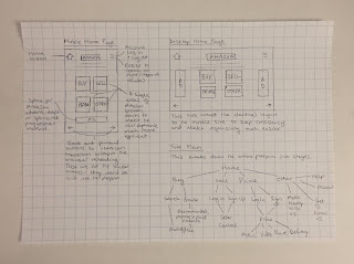
As the colour scheme and typeface had been confirmed, I was able to develop the wireframes, made earlier in the process, into digital designs. The site plan initially made covers almost every element of the Amazon website. As the main focus of this final response is on Amazon Prime, less of a focus was made on the marketplace areas of the site.

Sticking to the wireframes made, mobile and desktop designs were developed in Photoshop. A few adjustments were made when developing them forward. The home button has been replaced by a site language option, which makes the overall experience more accessible and easier to use for people in different countries. After doing some primary research, people suggested that the home button is unnecessary, as people tend to associate the company logo with home. Therefore, the Amazon logo acts as a home button. As for the accordion, it is more identifiable replacing the 3 horizontal bars with a user icon. Here, users can login and find other areas that would have been in the 'other' wireframe section.

As I wanted to spend more time on developing the Prime ad and platform itself, I did not develop the marketplace as proposed in the wireframes. Instead, the layout was slightly adjusted to the new branding. The home page design was used when developing the marketplace. This can be seen below.


Rather than researching into the best type sizes for devices and other aspects, a new program called Adobe Experience Design allowed me to check the designs on a variety of devices in real-time. This made the design process much more straightforward as I was able to judge the optimum size for specific screen dimensions.

Experience Design allows basic apps to built. Unfortunately, the only functions that the software allows is clickable buttons. As some more advanced functions were required, the basic app was built and recorded, before being imported into Adobe After Effects, where other functions could be replicated. This was the best way to create the walkthrough video for the site.

As the two main areas of Amazon are the Marketplace and Prime, a simple choice is given to users when arriving at the home page. Whilst this is much more stripped down than the current Amazon layout, it is a much more straightforward user experience. Other features, such as deals and ads would later be introduced if Amazon chose to develop this concept; however, for now, the design focuses on the key sections of Amazon. Aspects of the Amazon marketplace were taken and arranged into a mobile format, which can be seen below. The cluttered marketplace has been stripped down and simplified into 3 main sections, with a new category area recommended specifically for users. Whilst this looks very similar to the existing Amazon layout, slight changes have been made.

The first problem identified with Amazon Prime is that its interface is confusing and overly complicated, where all of Prime's features should be brought together, with a clear consistent aesthetic across all platforms. To tackle this task, the analysis made earlier in the project of the entire Prime platform was used to create a vastly different and more consistent, clear aesthetic across the Prime area of the site. The simplest way to develop Prime was to make a site plan, which is much simpler for existing users and also users that do not know what Prime is. The Amazon Ad will be made after the walkthrough video, to ensure that the marketing material ties in with the branding for the best possible consistency.


One problem highlighted with Prime regards the parental controls, and how the user experience does not change for different users. Whilst certain programs can be password-protected, a children's film or TV show could be right next to an adult, gory series, which can be troublesome when allowing children to use the platform.

Netflix, a fellow entertainment provider, solves this problem with ease by allowing users to have their own profiles. These profiles can have set maturity levels, which restricts children from seeing certain programs. This concept is one that was considered when creating the site plan to make the user experience much more personal and safe.

To create an aesthetic that is different to Netflix and keep consistency with the new Amazon site branding, three more layouts were created for the user area. Once registered with Prime, users have the ability to set up profiles. Much like Netflix, certain age-specific profiles can be created that prevent certain users from viewing specific content. Adult users, identified next to a small lock icon, must input a password before entering the platform. This prevents younger users from accessing unsuitable content and also allows the user experience to be much more fluid, as users are not prompted for a password every time they want to watch an adult program/listen to an explicit song.

Child users are much more restricted once logged in. Parent users can determine what features child accounts can access. For the purpose of the walkthrough video, I will include two users - Lorraine (the adult account) and Millie (the child account). The entire process will be narrated to explain how the process works. Millie will be restricted to just Amazon Music & Video, with no access to explicit songs and certain-aged programs.


Mockups of how the user experience changes for different profiles were made to highlight how the content would be categorised. The layouts of both Music & Video would be exactly the same; however, content for different age groups would be entirely different. Below, mockups for Lorraine (to the left) and Millie (to the right) can be seen. Completely removing certain age-restricted material from a profile makes the entire user experience safer and more enjoyable as a whole. These mockups will be used in the walkthrough video.


In terms of the walkthrough video, a storyboard had to be made before commencing with the animation work. This was the easiest way to determine which pages needed to be created. The process was broken down simply into 8 stages.


By thinking about the design process as the steps taken by a user, it was much easier to make the required pages for the walkthrough video. The mobile pages made can be seen below. They all stick to the typeface and colour scheme guidelines set to keep consistency, and are as simplistic as possible to make the user experience very clear.


Rather than presenting these pages as stills to a crit group, it was much easier to show the walkthrough video, as the user experience could be more visually explained. For this, the prime ad needed to be completed. This was the next stage in the process.