Sunday, May 14, 2017

OUGD505 - Module Evaluation


Overall, I found this to be quite a challenging module, particularly as I have tried to really push my skills to their limits. In the first Studio Brief, I produced my first screen print of this year, which was really beneficial in developing my practical skills. I feel much more confident producing analogue prints moving into Level 06 and will definitely try to produce more physical work next year. In the second Studio Brief, I really pushed my motion graphics skills, as well as my problem solving skills. Choosing Apple as a client was tough, as the outcomes had to be very high-quality; however, I feel that I managed to create outcomes that are effective and produced to a high-standard.

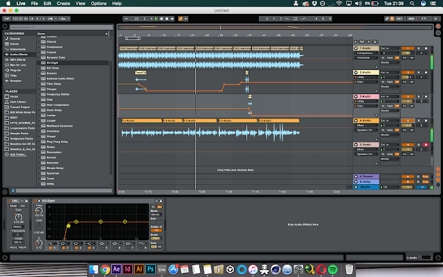
In terms of time management, this was definitely the most organised that I have been in any module so far. I think that this was because I planned my time out ahead of starting the individual briefs and thoroughly enjoyed completing the work; therefore, managed to complete the outcomes quite efficiently. Producing the walkthrough video and promotional video was the most time consuming aspect of the project as I wanted it to look as professional as possible for consistency with Apple’s previous commercials. Whilst I have identified that motion graphics is not a career pathway that I want to follow, I think that it is still beneficial to improve my skills in the area, as it will give me a more diverse range of possibilities to work with when going into industry. It was interesting to use my music production skills in this project also, as this is one aspect that I would like to tie into my practice more often.

What I learnt most from this project is the importance of message and distribution considerations. Studio Brief 02 opened my eyes to how target audience needs to be linked with distribution, and also how existing designs and campaigns can be analysed in terms of the effectiveness of their distribution, as opposed to their aesthetic.

If I could have done anything differently in this project, I would have liked to have worked with a coder, or app developer, to physically test the Apple Drive Mode. As I have already highlighted that I would like to promote this concept online to try and raise awareness of mobile distractions and potentially contact Apple, this is one possibility that I may try over Summer.

In conclusion, I am extremely happy with the quality of outcomes produced in this module. Over Summer, I am going to develop them further to upload and promote on Behance. This will hopefully increase my exposure moving into Level 06.


Thursday, May 11, 2017

OUGD505 - Studio Brief 02 - Product, Range & Distribution - Outcomes & Evaluation


All the outcomes produced can be seen on this blog post - particularly the final walkthrough video and promotional video, which are essentially the main two outcomes.

Overall, the solution created would physically stop the social issue of mobile distractions behind the wheel. Whilst I have only focused on iPhone owners, the concept could be applied to the majority of smartphones, as they are now built-in with microphones, motion sensors and update capabilites.

To gain some feedback on the entire campaign, I set up a small crit group of young adults (the main target audience being targeted) to see whether they think the proposed concept and promotional material effectively solves the issue and grabs their attention. Everyone agreed that it would definitely reduce the number of incidents due to mobile distractions behind the wheel because Drive Mode is compulsory. People thought that, because of this, the campaign is more effective than awareness campaigns, as it is a physical prevention, as opposed to an encouraged message. As the outcomes produced are consistent with Apple's existing visuals, people thought that the campaign would successfully grab people's attention, as there is already such a demand and buzz around Apple products as it is. People said that the distribution methods have been well informed to target younger people, as they tend to use social media and mobile devices more than the older generation. However, many people also thought that the campaign would appeal to all ages, as the tone of voice used and visuals are quite universal. This was great to hear, as it would allow a higher percentage of incidents to be prevented by distributing the update to all users, whatever their age.

One piece of feedback received regarded the walkthrough video, and the proposed idea of allowing BlackBox insurance users to see their driving data in real-time. People thought that this may distract people when driving, as they may keep looking at their phones to see their updated stats. This is one aspect that I would change if I developed the concept further - I would only allow users to see their driving data when Drive Mode has been disabled.

In conclusion, this was one of my favourite projects to date, as it had a real focus on problem solving and making a change to society. Picking Apple as my focus was quite challenging, as their existing visuals are produced to a very high quality; however, I feel that I have made a campaign that is consistent and carefully considered in this respect. Whilst it is a huge long-shot, I am going to put this project online to see whether I can raise some awareness and possibly contact Apple. Realistically, all smartphone providers and car manufacturers need to work together to solve the issue; however, projects like this may make them consider the possibilities they have.


Promotional Video


Distribution Methods


Explanatory Walkthrough Video / Pitch to Apple


Apple Site: Desktop Layout


Apple Site: Mobile Layout


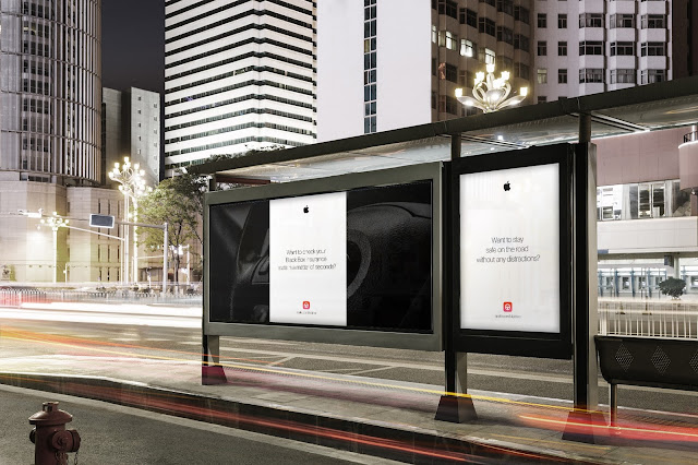
Promotional Posters


Physical Distribution Methods


Sunday, May 7, 2017

OUGD505 - Studio Brief 02 - Product, Range and Distribution - Production


As the concept and visual considerations were now settled on, I was able to move on to producing the outcomes. Distribution had already been considered throughout the idea generation and development stages, therefore outcomes were able to be made that would effectively target the target audience of young people. Whilst young people are my main target audience, I also wanted to ensure that Drive mode can be understood by all consumers, and Apple (when pitched to them). A lot of time was spent on ensuring that the outcomes were made to a high quality. The outcomes that needed to be produced are:
  • A logo for Apple Drive.
  • A walkthrough video that would be pitched to Apple, to highlight how the mode would physically work and be distributed.
  • A promotional video that would be distributed on social media, targeting young people online. Informed by research, this needed to be 30-60 seconds in length for the best effectiveness. This would also be distributed on TV, as Apple do not tend to use social media.
  • Posters that aware people of the new mode. These would be physically distributed to reach a wider audience, as all the other outcomes produced would be digitally distributed. 
  • A desktop and mobile layout that informs consumers of the new mode, how it works and why it has been introduced.
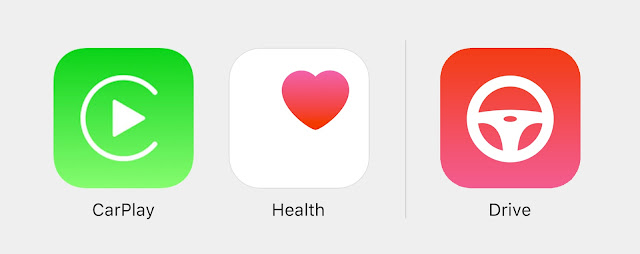
In terms of the Apple Drive logo, inspiration was taken from Apple's existing icons. As Apple use visual metaphors, it was appropriate to use a steering wheel for instant recognition with driving. As the mode is aiming to promote safety and wellbeing, the colours from the Apple Health icon were used.


Initially, I gained feedback on the following four symbols. Everyone agreed that the top right icon is the most suitable, as it has the best weight with the other icons in the Control Centre.


The promotional video and walkthrough video were produced in Adobe After Effects. Inspiration was taken from previous Apple commercials, which use a combination of fast paced text transitions and smooth, sleek transitions, alongside white a background, black type and simple, clean imagery. 


As the promotional video is mainly targeting at a younger audience, Zara Larsson's track 'Lush Life' - the 3rd most popular track of 2016 in the UK - was used to grab the audiences attention. For the walkthrough video, a more subtle background track was used, with my own voiceover and added sound effects.


In terms of promotional posters, feedback highlighted that young people are very inquisitive, and that they need to be enticed by an incentive. To effectively do so, I based posters on questions related to the new mode. These aim to intrigue the younger audience by making them want to learn more about the update.


Lastly, desktop and mobile site layouts were entirely inspired by existing layouts on the Apple site. Design considerations were informed by the visual aspects highlighted in the development stage.