As the concept and visual considerations were now settled on, I was able to move on to producing the outcomes. Distribution had already been considered throughout the idea generation and development stages, therefore outcomes were able to be made that would effectively target the target audience of young people. Whilst young people are my main target audience, I also wanted to ensure that Drive mode can be understood by all consumers, and Apple (when pitched to them). A lot of time was spent on ensuring that the outcomes were made to a high quality. The outcomes that needed to be produced are:
- A logo for Apple Drive.
- A walkthrough video that would be pitched to Apple, to highlight how the mode would physically work and be distributed.
- A promotional video that would be distributed on social media, targeting young people online. Informed by research, this needed to be 30-60 seconds in length for the best effectiveness. This would also be distributed on TV, as Apple do not tend to use social media.
- Posters that aware people of the new mode. These would be physically distributed to reach a wider audience, as all the other outcomes produced would be digitally distributed.
- A desktop and mobile layout that informs consumers of the new mode, how it works and why it has been introduced.

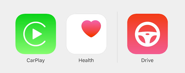
Initially, I gained feedback on the following four symbols. Everyone agreed that the top right icon is the most suitable, as it has the best weight with the other icons in the Control Centre.
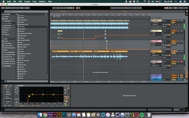
The promotional video and walkthrough video were produced in Adobe After Effects. Inspiration was taken from previous Apple commercials, which use a combination of fast paced text transitions and smooth, sleek transitions, alongside white a background, black type and simple, clean imagery.


In terms of promotional posters, feedback highlighted that young people are very inquisitive, and that they need to be enticed by an incentive. To effectively do so, I based posters on questions related to the new mode. These aim to intrigue the younger audience by making them want to learn more about the update.

Lastly, desktop and mobile site layouts were entirely inspired by existing layouts on the Apple site. Design considerations were informed by the visual aspects highlighted in the development stage.
The promotional video and walkthrough video were produced in Adobe After Effects. Inspiration was taken from previous Apple commercials, which use a combination of fast paced text transitions and smooth, sleek transitions, alongside white a background, black type and simple, clean imagery.
As the promotional video is mainly targeting at a younger audience, Zara Larsson's track 'Lush Life' - the 3rd most popular track of 2016 in the UK - was used to grab the audiences attention. For the walkthrough video, a more subtle background track was used, with my own voiceover and added sound effects.


In terms of promotional posters, feedback highlighted that young people are very inquisitive, and that they need to be enticed by an incentive. To effectively do so, I based posters on questions related to the new mode. These aim to intrigue the younger audience by making them want to learn more about the update.

Lastly, desktop and mobile site layouts were entirely inspired by existing layouts on the Apple site. Design considerations were informed by the visual aspects highlighted in the development stage.


No comments:
Post a Comment