Concept Generation -
As the outcomes in this brief must be purely digital, for this stage in the process I am going to focus on creating solid concepts that could then spark ideas later in the development stages. Informed entirely by the research made in the previous stage of the project I have made three main initial concepts.
 Concept 1
As 'Sierra' means a chain of mountains, I visually analysed the form of peaks and hills to see whether any patterns could be found. Whilst peaks can follow very random lines (indicated by the diagonal lined image), the overall direction of peaks can be uniform/parallel in direction (indicated by the filled line image). As seen, a grid can clearly be made from the direction of peaks.
By slightly rotating the grid identified, the horizontal lines can be used as a baseline for type to be set within. As seen, the type must be slanted in appearance to fit the grid set. By roughly using the grid I have made a range of initial ideas.

 Concept 2
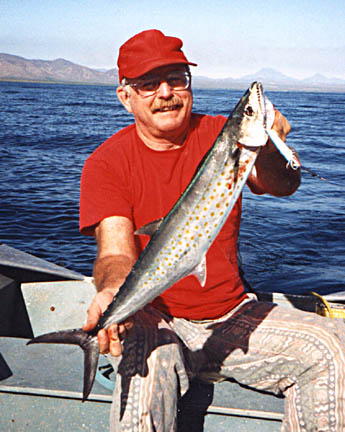
In the research stage, a link was identified between two definitions; firstly, the letter 'S' is represented by 3 dots in morse code, and secondly, the Pacific Sierra fish is covered in yellow-brown dots. The main idea behind this concept is to therefore combine typography with dots in some way.
By sketching a variety of ideas it is clear that there are multiple different ways in which dots could be incorporated into an identity. Replacing the dot in the letter 'i' for three dots is one possibility, alongside incorporating the three dots into surrounding type borders and spaces.

 Concept 3
The third main concept focuses entirely on morse code, and how it could be used to produce a unique typeface. The morse code for 'Sierra' is '... .. . .-. .-. .-'. As opposed to in ordinary type, morse code letters all have different widths. Because of this, I have been inspired to apply the widths of morse code letters to normal type. As seen in the rough sketch below, the width of 'S's morse code is triple 'E's, whilst 'R' has a similar width. The overall result is a word that has letters with varying widths.

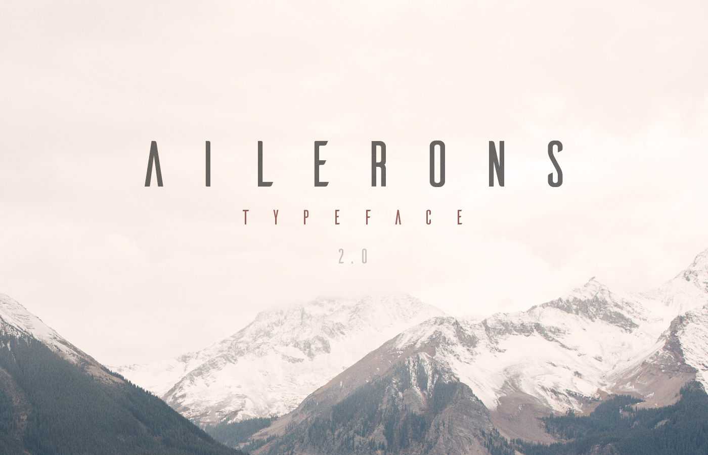
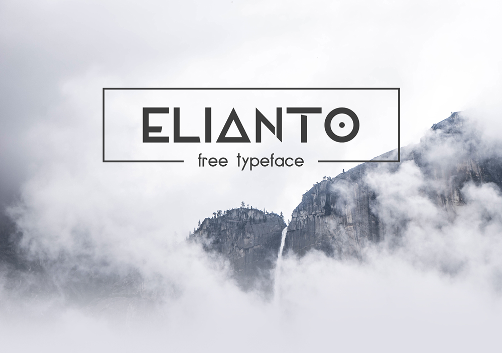
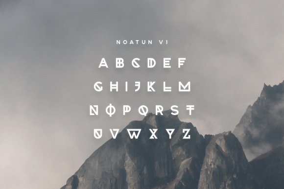
Some visual research of this style has been made to present to B&R.
 Feedback
 - Today I pitched the concepts to B&R over a Skype call, as planned in the project time sheet. I wanted to hear their thoughts on the concepts more than their opinions on the rough sketches made, as an overall concept is more important than the visuals at this stage.
Their favourite concepts are the first and third, purely because they would produce a purely unique outcome, typeface wise. They said that clients are all about having something that others can't; therefore, an identity that is not attainable elsewhere (i.e a custom logo/typeface) would most likely be of interest to them. They have suggested to not push the letter widths too far in the third concept, as the name needs to be easily legible and look professional.
The second concept has been given some form of approval by B&R. They do not want me to develop forward any of the ideas where the three dots would be incorporated into the lettering, as they think this would reduce the readability of the word. However, they have given me the all clear to develop forward some border ideas and shape concepts.


 To produce the stretched type identities, the morse code for 'Sierra' firstly needs to be divided into sections. The grid created by doing so in Illustrator can be seen below. The 'Sierra' type has been placed on the baseline in the three different typefaces. Each letter has then be stretched within the guides made.


