Tuesday, November 29, 2016

OUGD503 - Studio Brief 01 - Major Brief - Outcomes & Evaluation


Overall, this project was really beneficial to my practice. It was quite a challenge completing such a substantial brief without the assistance of peers and uni sessions. I have completed branding projects before; however, feel that this was the biggest task to date. Whilst B&R's client may eventually not even decide to use these logos, all that matters for the brief set is that client I worked with did. As B&R accepted 3 final logos, it is fair to say that the outcomes produced are successful responses to the brief set. The megalodon tooth inspired logo will be fairly obvious to the owner because it relates to his personal possessions, whilst the other two are much more ambiguous and subtle. This was one of the requirements set in the initial brief; therefore, I am confident that the logos could be used for the exterior signage and general branding.

Time management in this project was really crucial to ensure that the work was completed on time. Confirming dates for feedback sessions at the start of the project was one aspect that I am going to try and incorporate more into my uni work. It made the entire process much more organised and divided each stage in the process much more clearly, so that I could constantly understand the client's thoughts on work produced.

Whilst the logos produced will most likely be associated to Bannenberg & Rowell if used, the more important aspect that I get from this brief is experience and contacts. Superyacht logo design is a very profitable area, and is one area that I definitely want to continue working in with relation to freelance work. Working on such a substantial live brief has improved my communication skills and understanding of client needs. Furthermore, as the logos needed to be scalable to any size, I was able to really improve my skills in Illustrator. This is one program that I tend not to use because I am much more experienced in Photoshop. However, after developing such a wide range of logos, I feel much more comfortable working in Illustrator.

As no real information was given regarding the yacht owner, the idea generation stage was very challenging. Other briefs picked identify who the client is, therefore they were much easier to complete. In this sense, I considered this as a substantial brief, as it took a lot more time to complete - especially when trying to find concepts that would be suitable. The three weeks spent on this brief were treated as 9-5 days. This was to ensure that I could produce the best work possible and treat the entire project as I would if professionally freelancing. If I could spend more time on this brief I would love to personally present the ideas to the yacht owner. Unfortunately, this will not be until the yacht is near completion; however, it may be a possibility later down the line.

Thursday, November 24, 2016

OUGD504 - SB2 - Design for Screen - Amazon Brand Guidelines

Like any other large company, Amazon has brand guidelines. These can be changed when rebranding a company; however, if changing certain aspects under the current branding, the following rules must be followed. Their 2016 logo regulations can be read below.

Amazon Text Link CTAs

The following CTAs are allowed in Amazon branded text links:

• Shop now at Amazon.com
• Shop now
• Pre-order now
• Learn more
• See details
• Watch now

Amazon text links should conform to the following standards:

• Typeface & Sizing - Amazon Text Link CTAs should always be set at one of two sizes – Frutiger 57 Condensed at 11.5 point for small applications and Frutiger 67 Condensed at 14 point for large. Recommended small applications include small IAB ad units (Micro Bar, Button 1, Square Button, Half Banner, Full Banner) or custom units such as site stripes, mini marquees, etc. Recommended large applications include large IAB ad units (Medium Rectangle, Wide Skyscraper, Skyscraper, Leaderboard), or custom units such as home page pushdowns, marquee pushdowns, etc.

• Graphical Styling - The underline should ‘break’ for descenders, that is to say there should be one pixel of clear space on either side of each descender.

• Colour - The CTA can be any colour as long as – 1) all elements within the CTA (arrow, text and underline) use the same base colour, 2) the CTA complements the promotional graphic it is used in, and 3) it stands out enough to be seen. The opacity of the underline and arrow elements should be set to 70% of the text colour.

• .com Usage - Although “Amazon” is preferred, using “Amazon.com” for CTA text links is also acceptable. (applies to amazon.com, amazon.co.uk, amazon.ca, amazon.de, amazon.fr, amazon.it, amazon.es, amazon.co.jp, etc.)

Amazon Capitalization & Punctuation

Amazon should always be in title case (all capitals or lowercase is not allowed).

Brand Phrases

The use of Amazon proprietary words, phrases, products, etc. that directly tie into Amazon functionality or features is allowed (e.g. “Gold Box Deal Of The Day”), but requires approval from Amazon. Outside of this context, use of Amazon branded terms or similar statements are not allowed unless expressly approved.

This includes but is not limited to:

• Gold Box
• Deal of the Day
• Super Saver Shipping
• 1-Click
• Seller Central
• Wish List (or Wishlist)
• Today’s Deals
• Subscribe & Save
• Kindle
• Amazon Mom
• Look Inside the Book
• Similar phrases (e.g. – “One Click Install”)

Logo Guidelines


Amazon's current logo is a custom typeface; however, they previously used Officina. The typeface that looks most like Amazon's current logo is Officina Sans Pro Black. I will consider using this for headers to keep consistency with the logo typeface. For body copy, Amazon's platform currently uses Arial Regular. This will also be considered when developing forward designs.


Wednesday, November 23, 2016

OUGD504 - SB2 - Design for Screen - Response Ideas


After analysing the desktop and mobile versions of Amazon Marketplace and Prime, two main ideas became clear in terms of responding to the problem set.

1) Re-market Amazon Prime so that the entire platform is promoted. One aspect that was highlighted from primary and secondary research made is that the marketing of Prime is not very clear. Many people that I spoke to in person thought that Amazon Prime is a rip-off, due to the £90 charge after the trial is over. Furthermore, a very small amount of people knew that Amazon Prime encompasses Amazon Video, Music and unlimited photo sharing - not just 1-day delivery. A few of Amazon's commercials this and last year focus purely on the 1-day delivery of Prime. Amazon did make a promotional video for the Amazon Fire Stick; however, it does not highlight clearly what Amazon Prime offers either.


The marketing campaign should aim to attract not only the 15% of online users that don't use Amazon, but the entire online and offline audience too. It should highlight what Prime is, how much it is and the difference between the Fire Stick and Prime itself.

Alongside re-marketing Prime, the user experience should be developed in response to some of the problems identified. One aspect that was highlighted was how Prime does not separate certain programs areas from one another. This means that a child program could be next to an adult film. Simon said that this is particularly frustrating as his child could click on an inappropriately aged film with easy. Whilst Amazon offers parental controls, this requires a password to be put in on certain age-restricted material. This is beneficial in preventing your children from watching programs they shouldn't; but, can become very frustrating when trying to watch multiple shows on your adult account, as you would have to continuously fill in the passcode. This is one user experience that could be overcome.

Solutions:

 A much clearer marketing point that fully explains the entirety of Amazon Prime.
 A developed user experience - the functionality and design of Prime should be built on to answer some of the problems identified.


2) Rebrand Amazon Marketplace so that the site appeals to the 15% of online users that do not use Amazon. Online shoppers who don’t use Amazon are motivated by different things than Amazon shoppers - they are motivated more by a sense of belonging, care about a knowledgeable staff/easy return policy and appreciate the personal touch of smaller online retailers. Many non-Amazon users do not enjoy the complexity of the platform and much prefer the simpler, more straightforward process of ordering items that smaller online retailers offer. The analysis made highlighted a lot of problematic areas in which the user experience could be improved dramatically - the main aspect that comes across is that the Amazon site is all about advertising rather than the user experience. This will be investigated and changed accordingly.

In this sense, some ideas will be generated to try and widen Amazon's target audience. Current users will need to stay engaged with the website too, therefore a fine balance in terms of the site's change will need to be considered. The main emphasis of this response will focus on the user experience more than anything.

Solutions:

 A complete redesign of Amazon's desktop, tablet and mobile site. The mobile site is a main priority, as the majority of users visit Amazon on this device.
 A moving outcome that physically shows how the website works. This could be a mockup video made in After Effects to a fully working site.

Tuesday, November 22, 2016

OUGD503 - Studio Brief 01 - Major Brief - Further Feedback & Production


At the start of the third working week, all the digitally developed designs were presented to Bannenberg & Rowell, with thorough explanation and use of imagery to highlight how, and why, ideas had been developed. Overall, all the logos, apart from the shark shaped vectors, were given positive feedback. B&R thought that the shark type was still too difficult to read and would not suit the overall style of the yacht. For this reason, these ideas were not taken any further. Out of all the ideas generated, 3 main digital outcomes were chosen to use and develop further. These can be seen below.

In terms of the typographical ideas presented, the mirrored dorsal fin 'M' design was B&R's favourite. The incorporated dorsal fin notches were also strongly liked; however, to ensure that the symbol and type did not become overcomplicated, it was agreed that just type should be used (without notches) to accompany the symbol. The main feedback given regarding the type was that seems very narrow and condensed horizontally. The tracking was increased in response to this to increase the overall readability.


B&R asked to make the megaladon tooth fossil aesthetically less harsh. For this, the edges of the tooth and stems were smoothed and curved, to produce a sleeker appearance. This design was much preferred and was selected as one of the final logos. B&R were very positive about the notched dorsal fin 'M' and were happy to take that forward as a final logo also.

The final area of development focused on the shark scar outcome. Initially, I used the same typeface as used in the other 2 final outcomes and presented it for some feedback. B&R commented that the typeface was too bold and heavy for the symbol made. As this concept is more illusive than any other, the type needed to be revised. Two lighter type options were produced. Overall, the sans-serif typeface was chosen to take forward as a final logo.

The last few days of the third week were spent compiling the final deliverables. A PDF of all the digital designs produced was made, as well as a PDF with the final 3 accepted. Both included imagery that could be used to walk the client through the design choices made. This was given to Bannenberg & Rowell at the end of the week and I was paid the full commission as agreed. Some mockups of how the logos could be implemented on the boat exterior and garments were made; however, these cannot be shown due to the non-disclosure agreement.


Monday, November 21, 2016

OUGD504 - SB2 - Design for Screen - Platform Analysis


Before generating ideas in response to the problem set, Amazon Marketplace & Prime were carefully analysed in terms of accessibility, usability, adoptability, desirability and value. Identifying specific problems allowed the idea generation stage to be much much easier.


Homepage & Responsivity - One aspect that is very surprising about Amazon's platform is that it is not fully responsive. As seen in the comparison below, the content on their site does not adjust after being stretched to a tablet size. This is most likely because they have fixed mobile and tablet layouts. Whilst this means that the site is optimised for different devices, fixed layouts are not fully responsive, as they do not change to specific screen sizes. This is a real problem as content can become too small/large in scale on devices that are slightly different to the designed fixed layout dimensions.

Only studios' website is a very effective example of full responsivity. The type and images resize for all device sizes, which ensures that every user gets the best experience possible. In this sense, the role of responsivity should be considered when producing layout ideas. As the research indicates that the majority of users view Amazon on their mobile phones, it is more appropriate to design for this format before a desktop layout.


Upon further inspection, it became clear that Amazon's home page is overly cluttered, with a real focus on advertising as opposed to the user experience. A few colour co-ordinated diagrams, seen below, highlight some of the problems I found when using the home page. The coloured circles represent the following:

Red - Amazon Prime, 'Try Now'
Green - Your Account
Blue - Gift Cards
Yellow - Sell

As evidently seen, there are 6 Amazon Prime buttons on the first section of the home page. Whilst this may be considered as a very visual way of pushing the service, the unstructured, disorganised amount of buttons across the page, for the same feature, make the usability experience quite confusing and complicated. This use of multiple buttons for the same feature can also be seen by the 'Your Account' and 'Gift Cards' buttons. When looking at smaller online retailers, it is obvious that the user experience is much more clear because there is one button for each function, which makes shopping instantly simple and more efficient. This is one reason for why non-Amazoners do not use the platform, because the experience is not as personal or straightforward as those on smaller sites. The website could be simplified a lot in this respect.

As for the yellow ring, this highlights the 'Sell' button. Upon first glance at the home page, I found it very difficult to even find this button, as the type size is very small and merges in with the other menu options below the search bar. Whilst this is consistent with the colour scheme and site typeface, you would think that the 'Sell' button would be emphasised in a much clearer way, as it is one of the 3 most important areas of Amazon - there are now over 2 million sellers worldwide, which account for over 40% of the total units sold on Amazon. 


For a comparison the mobile site was analysed in a similar manner. Whilst the overall look of the site was the same as the desktop layout, a lot of the functions were much harder to find. Whilst the 'Your Account' button is still heavily used on the mobile layout, with 3 'Sign In' buttons being easily viewable on the front page, there is nowhere to find Prime whatsoever on the mobile site's home page, which strongly contrasts against the desktop site. This inconsistency between the 2 platforms is very ineffective, as users will have an even more confusing experience on their phone than on a computer. As for the 'Sell' button, you have to scroll to the very bottom of the browser to find it. This once again highlights how the user experience is not as considered as it could be. The only consistency on both platforms is how the search bar is clearly visible at the top of the app, which is crucial as nearly half of web shoppers go directly to Amazon for product searches. It is clear that the entire home page needs a few changes.


Selling - As touched upon already, the 'Sell' area of the site is actually quite difficult to find, especially on the mobile site. To find out about what the sign-up process and selling platform is like, a recent video on YouTube was watched. I could not test this area of the site because there is a £25 monthly fee to sell items on Amazon.


Overall, the signup process and selling process appears to be very straightforward. The Amazon Seller Central space is very similar to Ebay's layout, which is very organised and clear to use. One aspect that seems slightly strange is how there are 2 types of seller accounts - one for full-time sellers and one for occasional sellers. To sign up as an occasional seller, you must click the tiny line of text to the bottom right of the banner, which initially is hardly even noticeable. A screenshot of this can be seen below. Amazon appear to be quite sly with their marketing; as later seen with Amazon Prime, the fee after a 2-day trial is almost hidden away. This lack of honesty with the consumer is another reason for why the 15% choose not to use Amazon.


In comparison to the marketplace's layout, Amazon Seller Central is much cleaner and overall more user-friendly, as the menu bar is very stripped down, dividing the platform into various specific areas. The user experience looks much better than the analysed home page - as users and businesses pay monthly to sell items, Amazon has clearly put a much lesser focus on advertising than the user experience. This should be applied across the whole website; not just for premium members, as the user experience should be beneficial for everybody that uses the site.


Buying - In terms of purchasing items, the search bar at the top of the site is the main way to find items on Amazon. 44% of web shoppers go directly to Amazon for product searches, therefore keeping the search bar large and clear is a crucial part to the site. The desktop site has a very basic layout, with items being organised in a grid like fashion. To the left of the page are all the options that you can select to find specific items. This left section is fixed to the page, which means that when scrolling down to look at items, it doesn't move with the user. This is frustrating, as users must scroll all the way back to the top of the page to adjust their search criteria. The search bar is also fixed to the top of the site. This problem also occurs on the mobile site, as the accordian and 'filter' button stays at the top of the page.

When you reach the bottom of the page on the mobile site, there are buttons to either go back to the top of the page or to go to the next page. Annoyingly, when you press these buttons, the page refreshes, which causes your browser to have a long list of history when looking at multiple pages. It would make much more sense, on the desktop site and mobile site, to have an endless vertical grid of items, with no pages. The 'filter' button, side bar, search bar and accordions should move when the user scrolls, so that they constantly have the option to amend their search, without having to tediously reload the page or scroll up.

Other than these mentioned problems, the buying process is very easy to understand and works well.


Customer Support - I have never experienced problems with Amazon before in terms of customer service - tracking items and contacting buyers is very direct and efficient. When I was charged from Prime after the 2-day trial, I received the money back the next day after phoning their customer service line. This also was the case for many other people that have the same problem.

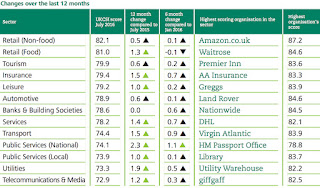
In July 2016, the Institute of Customer Service released an annual list of companies with the best customer service in the UK. At the top of the list is Amazon.co.uk, topping other renown companies such as Waitrose, Premier Inn & AA Insurance. The state of customer satisfaction in the UK is generated by getting 10,000 customers to rate their experiences of dealing with over 200 organisations across 13 sectors. Increases in customer satisfaction were most noticeable for organisations’ speed of response to written (letter or email) communications, for ease of getting through (over the phone), online experiences and the way complaints were handled. This relates back to the Prime experience; whilst many people are put off by the fee after the trial, the customer service that resolved the problem is quick to respond and ultimately focused on helping the customer.

On Amazon's site, there is a section dedicated to customer help. As explained with the 'Sell' section, the 'Help' button could be identified a bit more clearly

The page is separated into various headers to make the process more specific to the user's problem. This simplicity can be seen below. The ad placement for the 'Grand Tour' (with a warning symbol) feels very out of place, as this area of the site should solely focus on the customer experience. There is already a banner at the top of the page advertising the show; therefore, this addition feels unnecessary.


Once a problem has been specified, users can either e-mail, phone or live chat with Amazon support. The process is extremely quick and the customer support team are very helpful. One concern about the customer support process is that it does not clearly explain that the user will end up with the option to talk to an Amazon representative. Other market platforms that I have used before use a similar process; however, after specifying the problem, there is no option to chat to a representative - usually, you are given a few explanatory lines of information that do not help to solve the problem. In this sense, it would be clearer to the user if the e-mail, phone and chat option came before the other questions.


Prime - The 2-day trial aspect to Prime has already been mentioned; however, the functionality and layout needs to be reviewed. After signing up for an Amazon Prime account and logging in it became clear that the user experience could be massively improved. All the features of Prime are in a bullet point list to the right of the page. The images in the centre of the page are highlighting what you can enjoy as a Prime member. This is completely irrelevant as people seeing this page have already signed up for Prime and understand the features. Furthermore, the images are not even clickable - at first I thought they were to take you through to the video/music platforms but they aren't. After showing over 20 people in the class, every person was shocked by the overall appearance. Everyone agreed that there should be a much better welcoming platform, as customers are paying for that experience.


Upon checking out the Amazon Video & Music platforms, the overall layout improved much more. The Music site, in particular, is categorised very well, with various sections and functions being labelled specifically. In terms of Amazon Video, Simon highlighted one negative aspect that he found with using the platform. He said that, unlike Netflix, there is no way of restricting the site for different users. A children's film or TV show could be right next to an adult, gory series, which can be troublesome when allowing children to use the platform. Netflix solves this problem with ease by allowing user to pick who is viewing before exploring the film on show. This aspect should be considered with Amazon Video, and also Amazon Music (explicit songs).


For non-smart TVs, Amazon offers a Fire TV Stick, which essentially allows users to load prime and other streaming services through an app. Yet, for over 400 smart TVs, Amazon Instant Video is available - an app that is built into the TV when bought. This is one strong aspect to Amazon Prime as a product, as it is accessible to most televisions and devices.


As a whole, a few adjustments could be made to the overall layout; however, the functionality is fairly effective. The main problem identified with Prime is how it is marketed - it is not very clear what Prime is and there are too many name variants of it (Amazon Instant Video, Amazon Fire Stick, Amazon Video, Amazon Prime etc). 

Tuesday, November 15, 2016

OUGD504 - SB2 - Design for Screen - Self Chosen Brief

After considering a few brief ideas the final brief set can be seen below:

The client - Amazon

The problem - 15% of people who shop online decide not to use Amazon. Whilst this may seem like a minority, the total sum of people who do not engage with Amazon adds up to a total of 46 million users. It has been found that online shoppers who don’t use Amazon are motivated by different things than Amazon shoppers - they are motivated more by a sense of belonging, care about a knowledgeable staff/easy return policy and appreciate the personal touch of smaller online retailers. Many non-Amazon users do not enjoy the complexity of the platform and much prefer the simpler, more straightforward process of ordering items that smaller online retailers offer. In this sense, a response should be made that widens Amazon's target audience, keeps current users engaged and improves the overall user experience.

The target audience - The main target audience is both current Amazon users and non-Amazon users. The design treatment taken has to carefully consider both audiences; current Amazon users will not want a drastic change in the functionality of buying/selling, whilst the perspective of non-Amazon users needs to change. The target audience of online shopping is so wide that a universally accessible design needs to be made, as all ages/genders use the platform. Demographics and statistics will provide further information about the target audience.

Aims/Objectives - The main objective for this brief is to resolve the identified problem. Whilst there are a multitude of responses that can be taken, a digital outcome is more suitable as the main audience being targeted is online users. A variety of specific responses should be made to the identified problem. This will allow much more experimentation, which should result in a much more informed, appropriate end result.

Deliverables:

 A digital outcome that targets the 15% of users that do not use Amazon. The outcome should be successfully informed by research made.

 A consistent colour palette and typeface choice. This should tie in with the Amazon logo, brand guidelines and company's ethic.


Sunday, November 13, 2016

OUGD503 - Studio Brief 01 - Major Brief - Digital Development


After receiving feedback from the client, digital designs were produced. As the superyacht is huge in scale, the logos produced need to be able to be blown up to any size. To ensure this, designs were produced in Illustrator, as vectors can be scaled to any desired size.


To ensure that all the logos produced are aesthetically consistent as a set, Pantone colours were picked to constantly refer to and use. This was important to ensure that the presentation of digital outcomes looked professional and considered. B&R indicated that the logo would most likely go on the back of the boat, on a very dark grey panel. The closest Pantone colour to this was Pantone 419 C. As sharks were the main focus of inspiration in the idea generation stage, the colour scheme for digital ideas was also inspired by sharks, to keep the outcomes informed and consistent in concept. Pantone 425 C and 663 C are colours that were taken from the two main tones on shark bodies. Both colours were also inspired by close-up photographs of shark skin, and 425 C is also the main colour seen in shark tooth fossils.

Whilst sharks can be powerful, striking creatures, they can also be very illusive. This was one aspect that was also considered when selecting the colour scheme. Pantone 663 C produces a very bold, powerful aesthetic against the dark grey background because it is has a high contrast. Pantone 425 C on the other hand is less contrasting, creating much more of a subtle, illusive aesthetic overall. This difference in contrast was used to produce a really wide range of outcomes.


Certain shark-related images that suit the colour scheme set were gathered and used to create a range of initial logos. The first developed idea was the Megalodon tooth fossil concept. The initial sketches made were used to generate 3 main ideas. Out of these 4, the two to the right are the most identifiable in terms of representing the letter 'M'. The bottom left idea becomes difficult to distinguish when placed over the exterior box. For this reason, the two logos to the right were later developed and pitched forward.


The second bunch of ideas developed were those inspired by shark dorsal fins. Opposed to the illusive megalodon tooth ideas, the powerful, bold aspect of sharks was used as the approach. For this, the lighter pantone grey was chosen, as the high-contrast creates a more dominant aesthetic. For the typeface, a bold, thick sans-serif typeface was used. Serif typefaces are often delicate and light, which are not characteristics related to sharks. In this sense, a sans-serif typeface was much more appropriate. Uppercase letters were used to further emphasise the bold aspect and to make all the letters more uniform in terms of the x-heights - this makes legibility much easier. The ideas produced were simply inspired by the curved shape of dorsal fins, and also the unique notches in their fins. A variety of the initial sketches were experimented with and digitally produced to present to the client.


The third set of ideas were purely developed from the shark scar image found at the very start of the project. By using the initial sketch ideas, two digital vectors were made. To ensure that the jagged, natural aesthetic of shark scars were kept, a rough brush was used in Illustrator to replicate the effect. The lighter grey colour was used to make the two vectors more visible, as the lines are very thin and are difficult to see from a distance. Some extra information revealed that the client is Chinese. Because of this, some quick research was made into Chinese symbols, to see whether any relate to the two vectors produced. The symbol for 'water' is fairly similar in terms of there being 3 main stems and a horizontal line across them. Water is also very appropriate due to what the logos are for and the nature in which sharks live. As the symbol is quite fluid and curved, a more rigid, striking logo was produced to provide two different options to the client.


The fourth set of ideas focus purely on the use of up-close shark skin photographs as textures. Due to the varying tones in multiple shark skin photographs, the logos produced resulted in being an aesthetic mixture of illusive and bold. Like all the other ideas, these logos were developed from the sketches made initially. For this idea, focus was purely put on experimentation. Some of the logos produced were combinations of other ideas mentioned; one example of this is the letter 'M', which has a shark skin texture on top of it, multiple layers to hint at rows of shark teeth and cuts out the sides to emphasise dorsal fin notches. Others were inspired by the form of shark teeth and the curve of shark fins. Incorporating textures into the logos was one way to hint at sharks, without making the responses too obvious. This was picked up on later in the feedback received.


The last outcomes produced were the most obvious shark shaped typographic logos. This was the least favourable idea in the first feedback session. As agreed, the sketches were made in Illustrator to see whether the readability and legibility could be to a good standard. Because sharks are such elongated, condensed creatures, it was difficult to achieve a successful outcome. The two outcomes with the best readability and legibility were nonetheless used and presented in the following stage in the process.


OUGD504 - SB2 - Design for Screen - Amazon Research

Before setting a brief for this project some research had to be made into Amazon to try and find a problem that needs to be resolved. As Amazon is such a huge, successful marketplace, I wanted to challenge myself to really pick apart the site and find aspects that, not only designers but users, think are problems. Some research into their ethos, demographics and statistics were also made to ensure that problems raised are true on a global level.


Only Studios explained that it is very important to understand a company in terms of statistics and demographics. This influences the design decisions taken as the main focus has to be put on the target audience. A few points found regarding Amazon in the past year can be seen below:

  • Nearly half of web shoppers go directly to Amazon for product searches - A study by BloomReach in 2015 found that 44% of online shoppers go directly to Amazon before checking any other site. This has increased since 2012 by 14%.
  • During the 2015 holiday season, nearly 70% of Amazon.com customers used a mobile device to make purchases - The amount of people who use Amazon’s mobile app has doubled from the previous year. As such a large customer base uses mobiles/tablets, my design process should heavily focus on these formats before a desktop format.
  • There are tens of millions of Amazon Prime members, and that number is growing fast - Amazon Prime is a premium subscription service that offers its members a variety of perks, including access to Amazon’s online movie and music streaming libraries, and unlimited image storage on Amazon’s cloud storage database for £79 a year. The service also includes
     free expedited shipping that allows Prime members to get their goods in under 2 days. According to Business Insider, there are over 55 million Prime members, and that number is growing faster every day.
  • As of 2015, there are 304 million active accounts on Amazon - Unlike smaller companies, Amazon has to consider millions of people when thinking about their target audience. The design treatment therefore has to be univerally accessible to all ages.
  • Online shoppers who don’t use Amazon are motivated by different things than are Amazon shoppers - Non-Amazon shoppers are people who are motivated strongly by a sense of belonging, indexing 54% higher than Amazon shoppers. This trait is especially strong with millenials who index 160% over the average for being motivated by a sense of belonging. Additionally, non-Amazon shoppers care about a knowledgeable staff and, interestingly, an easy return policy. In other words, non-Amazon shoppers are more about the personal touch of smaller online retailers. Compared to non-Amazon shoppers, those who do use Amazon are much more likely to represent the overall Internet population (mostly because it’s a much larger group of people.) They are though, more likely to make impulse purchases and are motivated to make brand decisions that help their self-esteem and self-image. Millenial Amazon shoppers are even more motivated by self-image and are further motivated to purchase things if they are fun, exciting and rewarding.
  • The demographic of users is split almost exactly evenly between men and women - This further highlights how the design treatment needs to appeal to almost everyone, in terms of the target audience. Considerations will need to be made so that the site/app does not lean more towards a certain age group/gender.
  • Amazon uses analytics to their advantage - They know what their shoppers are doing, how they are shopping, what they like, and have a profile for each shopper with a personalized product assortment. It’s something that other retailers of all types can also accomplish, much of which is based on already available data that just needs to be tapped into.