Wednesday, February 28, 2018

OUGD603 - Brief 03 - Creative Conscience - Research


As food waste is a huge problem around the World, I have researched into statistics and existing solutions before generating ideas.


Background - To understand food waste, I researched into various statistics to identify the main causes and areas. Overall, the three largest food wasting continents are North America & Oceania, Europe and Industrialized Asia. For all three, consumer waste is roughly a third of the food waste problem, with production to retailing making up roughly two thirds.

In the UK, food is mostly sold through supermarkets and convenience stores, accounting to roughly 70% of the market. Online grocery shopping equates to 5.8% of the market; however, this is rapidly growing.


Alongside analysing statistics, I have researched further to find the main causes of food waste. In regards to consumers, feedback has highlighted that food waste occurs either because food is out of date, or because there is excess food left after eating which is thrown away. Consumers interviewed have said that the main incentives for not wasting food is saving money.

For retailers, there are laws that must be obeyed, which causes surplus amounts of food that are past their use by date to be thrown away. As this area of food waste is much bigger to tackle, with solutions being much harder to implement, I have chosen to produce a range of ideas that aim to make a difference to the way consumers use their food.


Best Before vs Use Buy Dates - In terms of food waste, there are two types of dates on sold foods that have different meanings. Essentially, use by dates are for safety and used for foods that go off quickly. Consumers should not use food or drink after the end date on these labels, as it can put health at risk. Yet, if the food has been frozen, the date of use can be extended. Best before appear on a wide range of frozen, dried, tinned and other foods. They are more about quality than safety, except for eggs. So when the date runs out it doesn't mean that the food will be harmful, but it might begin to lose its flavour and texture.

These two points are important to remember, particularly when regarding consumer food waste, as research has indicated that many people do not know about the difference between the two labels. Raising awareness of this is one aspect that has inspired a few of my ideas.


Existing Solutions - As food waste is such a large problem, there are already hundreds of solutions that have been created and implemented. Some of the existing solutions that have inspired some of my initial ideas are as follows:

Food Sharing

Olio is an app that encourages users to upload food that they do not want/need. This can be collected by anyone in the surrounding local area who has the app and wants the food. This aims to reduce the amount of consumer food waste and connect neighbours. This concept has inspired one of my initial ideas regarding the social solution to food waste.


Tracking Wastage

One method of trying to make people realise how much food they are wasting is through a tracking app such as Wise Up On Waste. The app allows users to enter how much food they wasted at each meal, and gives targets that users should aim to meet. Whilst this is a great concept, the challenge is getting people to download and use the app. This particular app asks users for their waste in kg, which is very specific. This has inspired the idea to produce a similar app that is more engaging and relative in terms of food waste measurement.

Food Suggestions

The Samsung Family Hub 2.0 is a refrigerator that tells you recipes based on the food inside. This could be argued to be helpful in combatting food waste as it suggests food that consumers could use up so that it isn't wasted. The downfall is that it is very expensive, making it less accessible and therefore less effective in terms of the big picture. This has inspired the idea to produce an app that notifies consumers of the shelf-life of their food, accompanied by suggested recipes.


Monday, February 26, 2018

OUGD603 - Brief 03 - Creative Conscience - Brief Interpretation


Following on from completing the D&AD brief, another competition that appeals to me is the Creative Conscience Awards 2018.

Essentially, there are a multitude of briefs that could be answered; however, the one that appeals to me the most is the 'Open Brief', which allows the freedom to tackle 'any issue [that i'm] passionate about solving'. One problem that I have wanted to try and address is food waste in the UK, as I identified in one of the PPP tasks that it is a big problem, with over 7 million tonnes of food and drink being wasted from homes every year.

The brief states that they are 'looking for solutions and provocations that have the potential to provoke action and have a genuine impact. Projects can be conceptual or have the potential to develop into real life-changing solutions'; therefore, I aimed to ensure that my resolutions have the potential to make a physical difference.

To ensure that I manage my time successfully in this brief, the time template was used once again. As food waste is a problem that has been tackled a lot, I think that the research stage and idea generation will take a week overall. For this reason, I have set myself two weeks to answer the brief. The deadline for submissions is the 20th April which allows me to ensure the outcome is submitted is to the highest quality possible.


Sunday, February 25, 2018

OUGD603 - Brief 02 - Hasbro - Outcomes & Evaluation


Overall, the game produced in this brief is one of the highest-quality outcomes that I have made over the duration of this course. Feedback from young people and those who were filmed playing the game highlighted that it is fun, engaging and suitable for the target audience of 16-26 year olds. A lot of people were impressed by the quality of materials, despite the fact that production was very cheap. The game concept, particularly the customizable aspect, was also received very well by multiple young people.

In essence, I believe that we have answered the brief as we have taken an old traditional game, which is not played by 16-26 year olds, and reappropriated it to appeal to them in the modern day. It works for 2+ people, is very quick to learn and could be played for up to, or longer, than 30 minutes. The game is suitable for parties because it allows players to customize forfeits, giving players the freedom to make the game their own.

Having a time plan made this project much easier to run, particularly as it is collaborative. It gave myself and Harrison deadlines to work towards, and ensured that we both met up to get the work completed. I took more of a managing role in this project, which I personally did not mind doing, as it allowed me to be certain that we were organised and had enough time for the production/submission stage.

If I could have improved anything, I would have liked to shoot the video with a variety of people, as the brief states that the game should appeal to men and women. Due to time restrictions, we had to do an all-men shoot. Many of the winning entries last year used one-gender footage however; therefore, this should hopefully not make an impact on the judge's decision.

In conclusion, this was one of the most enjoyable briefs that I have done so far. My production skills and knowledge definitely improved.

Submission Boards


Presentation Video


Packaging & Game Photographs


Saturday, February 24, 2018

OUGD603 - Brief 02 - Hasbro - Submission


As I had a placement in Shoreditch recently I was able to hand deliver it to the D&AD office. This saved delivery costs and any potential damage that could occur in the post.


Before physically submitting, a design board highlighting the research made and developments of our project needed to be made. By analysing the work done, I have condensed our design decisions into 4 main areas - why we chose to make a card game, what inspired us, the importance of game customizability and the choice of materials used.

Many previous winning entries had boards with very little typographic content on; therefore, I have kept the amount of text fairly low, with an even balance of images to accompany, to try and appeal to this year's judges.

Friday, February 23, 2018

OUGD603 - Brief 02 - Hasbro - Production: Presentation Video & Submission Boards


The brief requires a 90 second maximum presentation video to be submitted, that highlights how-to-play and the overall game concept. To find out what appealed to judges in the Hasbro brief last year, I have analysed presentation videos submitted by winning entrants.


The large majority of winners focused their presentation videos on gameplay, using physical footage of players in action. Some, used motion graphics to explain the instructions of the game; however, a higher percentage of winning entries use footage.

For this reason, I have chosen to physically shoot a presentation video, to try and appeal to the judges more in relation to the previous winners. Last year, we made a purely motion graphics based video, which wasn't successful. By hiring out some high-quality cameras and lighting sets, we are able to shoot a range of footage, using players that are aged within the set target audience. The gameplay has been split into various sections to explain the game's instructions and cards. 


To try and make the game appeal even further to the judges, we propose some expansion pack concepts. These would introduce new content in an attempt to keep the game engaging and current over time.

To make the presentation video interesting, clear and to the point, fast type and image transitions have been used. The video has been kept under 90 seconds, as desired, and filters have been applied to try and add a more professional finish.

Thursday, February 22, 2018

OUGD603 - Brief 02 - Hasbro - Production: Packaging


As we think it would be beneficial to submit a tangible game to D&AD than just a digital concept, we have chosen to physically produce it.

The first stage in the process was to get the cards manufactured. To get a high-quality, professional result we reached out to a card production company, who were able to print the two decks for a fairly affordable price.


To make the game appear well constructed and organised we wanted a sturdy, protective box that would contain the two decks of cards and instructions. Taking further inspiration from Asian culture, it was found that the most common building materials for houses in Asia are earth and wood, both of which have positive associations. We considered this when researching into boxes and managed to find a wooden box that has a divider for two poker card decks to fit in. The space in the lid also allows room for instructions to be fitted in. The price of the box was under £3, which is perfect for cheap production.


The box quality is great; however, it felt quite rough upon arrival and the wood needed to be treated. Gaining feedback from the woodwork staff and peers, the box has been coated with Danish Oil and sanded down to give a smooth finish. The top half of the box slightly warped when drying; however, this is one aspect that would be tested and prevented if taken forward.

For promotional reasons, it seemed appropriate to place the game name on the top of the box. The layout was central to keep consistency with the cards and instructions. Black matte vinyl has been used for this as it is cheap to produce and very fast to apply.


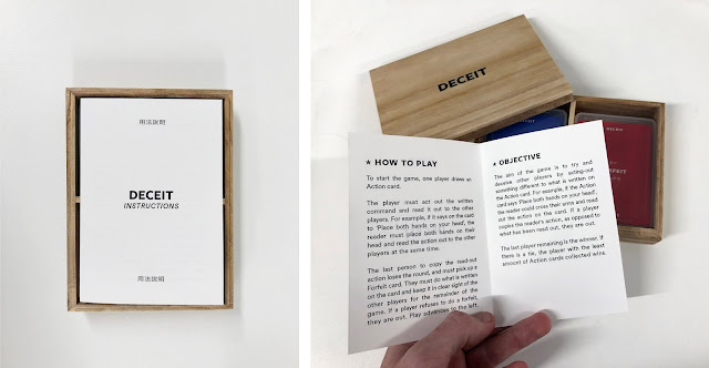
The last part of the process was to print the instructions. The dimensions of the instructions were changed so that they would cover the two decks of cards. The first print made can be seen below. The type is very small and feedback suggested that the layout needed to change to make it more readable.


For this reason, the type size has been increased and re-designed. The result is a small booklet that is much easier to read.


The final game packaging can be seen below.


Wednesday, February 21, 2018

OUGD603 - Brief 02 - Hasbro - Digital Development & Production Considerations


Colour - Whilst the target audience of the game is 16-26 year olds, it seems appropriate to use a colour scheme based on the most popular colours in The World, as this ensures that it appeals to a large majority of people. Research has identified that blue, purple, green and red are the 4 most popular colours.


Alongside being inspired by the most popular colours, I have also taken inspiration from Asian culture. This was inspired by the aspect of stealth in the game and relation to ninjas, and how they originated from Japan.


By combining colours and swatches from both aspects, I have produced a colour scheme. A blue/purple option and green was initially created; however, a crit group thought that the use of red works better with the blue/purple as they are analogous colours, which means they work harmoniously together.


Typography - I have analysed various Hasbro card games and last year's D&AD winners to see what style of typefaces have been used. All the games analysed use sans-serif typefaces, with the majority being bold at a small point size.


Whilst serif typefaces have been proven to have better readability than sans-serif typefaces, they tend to look very traditional and less modern than sans-serif typefaces. Due to the fact that such a vast majority of successful, existing games use sans-serif type and Hasbro wants the game to be modern, two sans-serif typefaces have been chosen to use. Freightsans has been used for headers and small lines of type as it is bold and very clear, whilst Circular Standard Book is a lighter typeface that has been used for longer passages of text, such as in the instruction booklet.


Content - In terms of the game content, myself and Harrison have written 52 actions and 52 forfeits that players could do. As drinking games cannot be directly marketed by Hasbro, we have made roughly a third of all cards player-customisable, meaning that they could make forfeits focused on drinking if they want to. The other forfeits are humorous and aim to make the game as fun as possible.

In terms of the game instructions, the concept has been simplified further and condensed into two sections - 'How To Play' and 'Objective'. The instructions are simple so that players can learn the game in under two minutes.


Layout - To ensure that the cards are designed in relation to existing UK games, poker card dimensions have been used to inform the layout. An appropriate bleed area is important to ensure that none of the content is lost later in the process. The layout made places the important content in the centre of the card for easy legibility and each card is accompanied with some Chinese translations to keep the Asian influence theme ongoing.


Action & Forfeit Cards

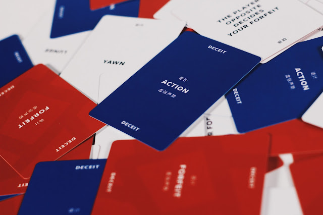
The content created with Harrison has been used to produce two decks of 52 cards, designed using the layout made. The front of cards are blue/purple and red, whilst the back sides are white for a strong contrast. The cards produced can be seen below.


Instructions

The layout has also been used for the game instructions. The concept made has been divided into two sections - 'How To Play' and 'Objective'. This breaks up the instructions and makes it clearer for players to learn how to play.