Colour - Whilst the target audience of the game is 16-26 year olds, it seems appropriate to use a colour scheme based on the most popular colours in The World, as this ensures that it appeals to a large majority of people. Research has identified that blue, purple, green and red are the 4 most popular colours.
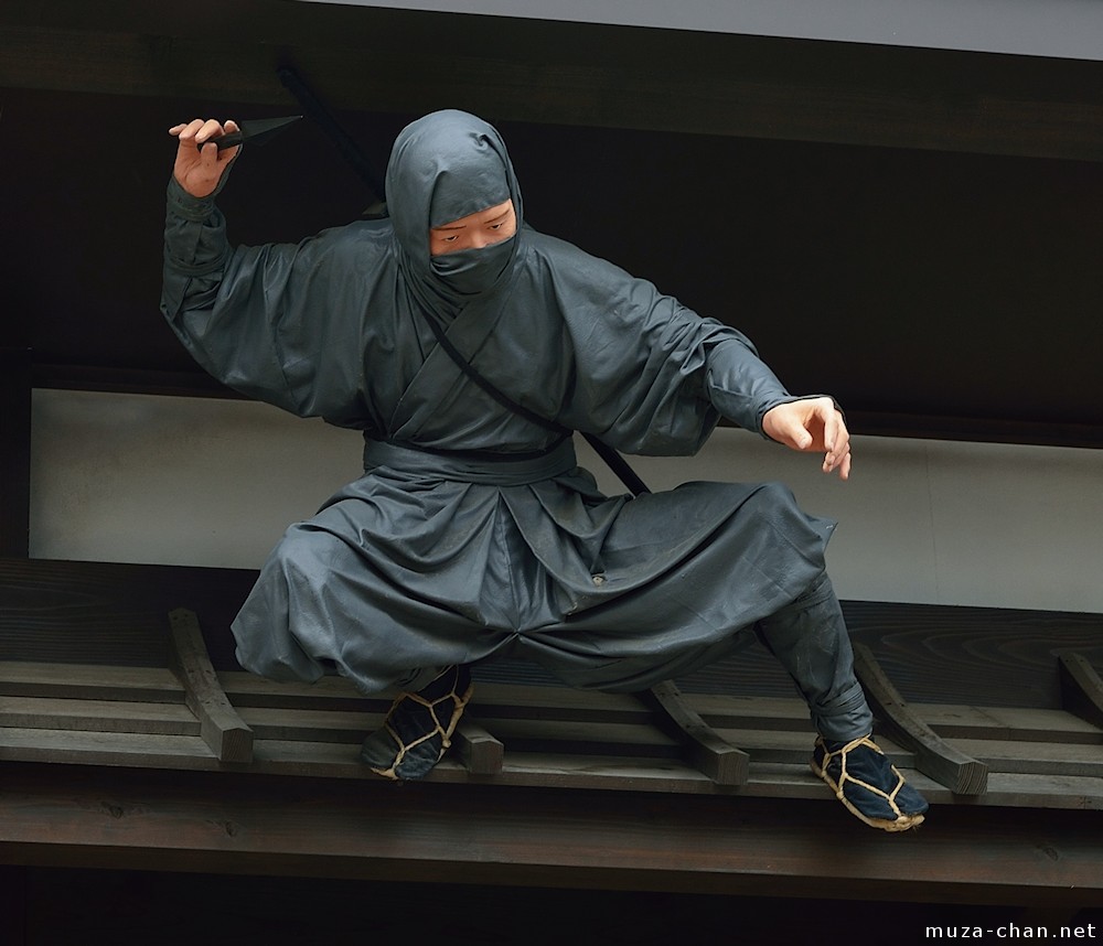
Alongside being inspired by the most popular colours, I have also taken inspiration from Asian culture. This was inspired by the aspect of stealth in the game and relation to ninjas, and how they originated from Japan.
By combining colours and swatches from both aspects, I have produced a colour scheme. A blue/purple option and green was initially created; however, a crit group thought that the use of red works better with the blue/purple as they are analogous colours, which means they work harmoniously together.
Typography - I have analysed various Hasbro card games and last year's D&AD winners to see what style of typefaces have been used. All the games analysed use sans-serif typefaces, with the majority being bold at a small point size.

Whilst serif typefaces have been proven to have better readability than sans-serif typefaces, they tend to look very traditional and less modern than sans-serif typefaces. Due to the fact that such a vast majority of successful, existing games use sans-serif type and Hasbro wants the game to be modern, two sans-serif typefaces have been chosen to use. Freightsans has been used for headers and small lines of type as it is bold and very clear, whilst Circular Standard Book is a lighter typeface that has been used for longer passages of text, such as in the instruction booklet.
Content - In terms of the game content, myself and Harrison have written 52 actions and 52 forfeits that players could do. As drinking games cannot be directly marketed by Hasbro, we have made roughly a third of all cards player-customisable, meaning that they could make forfeits focused on drinking if they want to. The other forfeits are humorous and aim to make the game as fun as possible.
In terms of the game instructions, the concept has been simplified further and condensed into two sections - 'How To Play' and 'Objective'. The instructions are simple so that players can learn the game in under two minutes.
Layout - To ensure that the cards are designed in relation to existing UK games, poker card dimensions have been used to inform the layout. An appropriate bleed area is important to ensure that none of the content is lost later in the process. The layout made places the important content in the centre of the card for easy legibility and each card is accompanied with some Chinese translations to keep the Asian influence theme ongoing.
Action & Forfeit Cards
The content created with Harrison has been used to produce two decks of 52 cards, designed using the layout made. The front of cards are blue/purple and red, whilst the back sides are white for a strong contrast. The cards produced can be seen below.
Instructions
The layout has also been used for the game instructions. The concept made has been divided into two sections - 'How To Play' and 'Objective'. This breaks up the instructions and makes it clearer for players to learn how to play.


No comments:
Post a Comment