Saturday, May 12, 2018

OUGD603 - Module Evaluation


Looking back at my initial aims and ambitions present in the initial statement, I feel that they have been effectively met in this module. As one of the ambitions was to complete a range of live briefs, I am very pleased with the various projects completed, as 7 out of the 8 briefs completed have been live briefs - 3 of which client focused and 4 of which competition focused. This has improved my communication skills with clients and definitely prepared me for working on real-life projects after University. Collaborating externally in two of the projects has also given me a lot confidence to work in a studio after University, as I now find it much easier to communicate with larger groups of people.

As many of the briefs completed are branding or music related, I aim to apply to studios that specialise in these areas. However, completing the loneliness brief opened my eyes to the impact of design on society. I therefore also aim to apply to studios that focus on social change and accessibility design, as I think it is the most rewarding field to work in.

One aspect that I never really identified before completing this module is that I always try to consider how something would function in the real world as opposed to being just a piece of design. In particular, I always tend to consider the marketing and business aspect of outcomes. Whilst this wasn’t necessarily documented in some projects I have been thinking ahead for a lot of projects. The food waste app, loneliness campaign, FLAC event and board game are all real-life ideas that hold the potential to be developed into businesses. I think that the business side of my DJing career has informed my practice in this sense, as I have to market myself and deal with business matters on a regular basis. This is an aspect that I am going to try and highlight after University, and I am aiming to take some of the projects completed forward and develop them into real businesses – FLAC and the loneliness campaign in particular.

Having to complete such a wide range of briefs in a set amount of time was very challenging; however, my time management skills have really benefitted from this module. I have learnt that I find it much easier to focus entirely on one brief for 1-2 weeks than a variety of briefs at the same time as I personally think it is more beneficial to not lose sight of the audience or brief deliverables. As this may not necessarily be the case in industry, I may have to adapt my process depending on the work and studio I go into. Pushing myself to complete various briefs in under a week was very useful as I learnt on the Smith Dawson placement that junior designers must work very efficiently under pressure.

Overall, I learnt a huge amount from this module. I know which areas of design I would like to specialise in after Uni and have produced a portfolio of work that I feel represents my strengths and interests. I aim to develop some of the projects after travelling and feel prepared to apply for jobs in September.




Friday, May 11, 2018

OUGD603 - Brief 08 - Wrapsody - Outcomes & Evaluation


The final outcomes produced can be seen on the following pages and on the handed in USB. These were presented to James for feedback. He was extremely pleased with the branding and particularly the van design, stating that it was exactly what he was looking for. He told me that he is aiming to buy a van very soon and begin working on it; therefore, I am very hopeful that my designs will be used and produced.

In relation to the target audience of young people and people working in Shoreditch I received feedback from friends in London who are aged 21-29. To ensure that their opinions were not biased I sent them the menu and van mockups and pretended that the vendor already exists, asking them if they would be interested in the food and if Wrapsody would appeal to them. All the feedback received was extremely positive - everyone spoken to said that the design is very energetic and colourful, and that the food would appeal to them. A few people highlighted that the menu could be improved to include more vegetarian/vegan options, as there is currently only one main option on there; therefore, this is something that could be considered with James when developed further. Other than this the feedback suggested that the outcomes would be appropriate for the desired audience.

If I could have done anything differently in this brief I would have liked to physically produce some packaging designs rather than just mockups. Because of the limited timescale of this brief mockups were produced instead; however, I aim to design a variety of nets and packaging ideas for Wrapsody moving forward. The time plan made was very useful as it ensured that I completed the brief ahead of hand-in. It only took 5 days to complete which allowed me to have the weekend to arrange all my work for submission. It was also very useful as I was able to receive feedback throughout the project from James to ensure that designs were heading in the appropriate direction.

Overall, this was a really fun project to complete and a really enjoyable finish to the module. I hope to work with James after Uni and freelance for him, as it would be beneficial financially and in terms of getting my work out in the real world.


Thursday, May 10, 2018

OUGD603 - Brief 08 - Further Feedback & Production

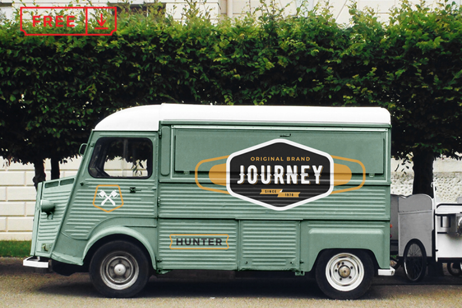
I need to develop mockups of the van's design and packaging, alongside the menu, which James has sent sent over. Some visual research has been made to find images to use for the mockups.


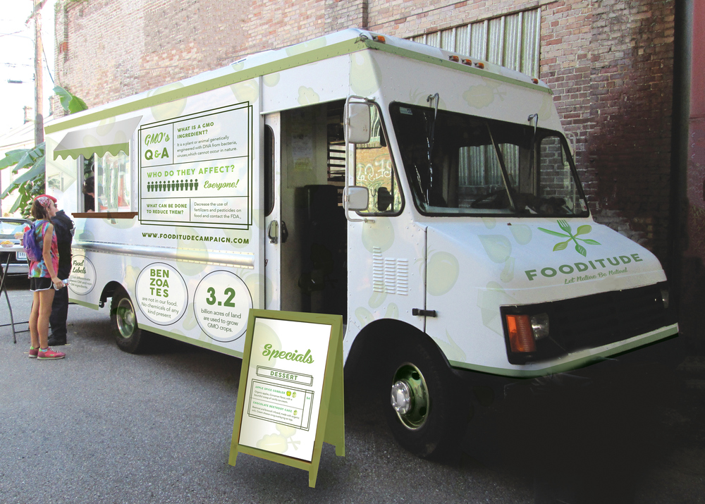
I referred back to the research made into existing vendors and was inspired by the van's analysed to cover the Wrapsody van in one of the bright, colourful patterns. This would be a visually effective way of grabbing people's attention in Shoreditch. The menu research was also referred back to, inspiring the layout of the Wrapsody menu.

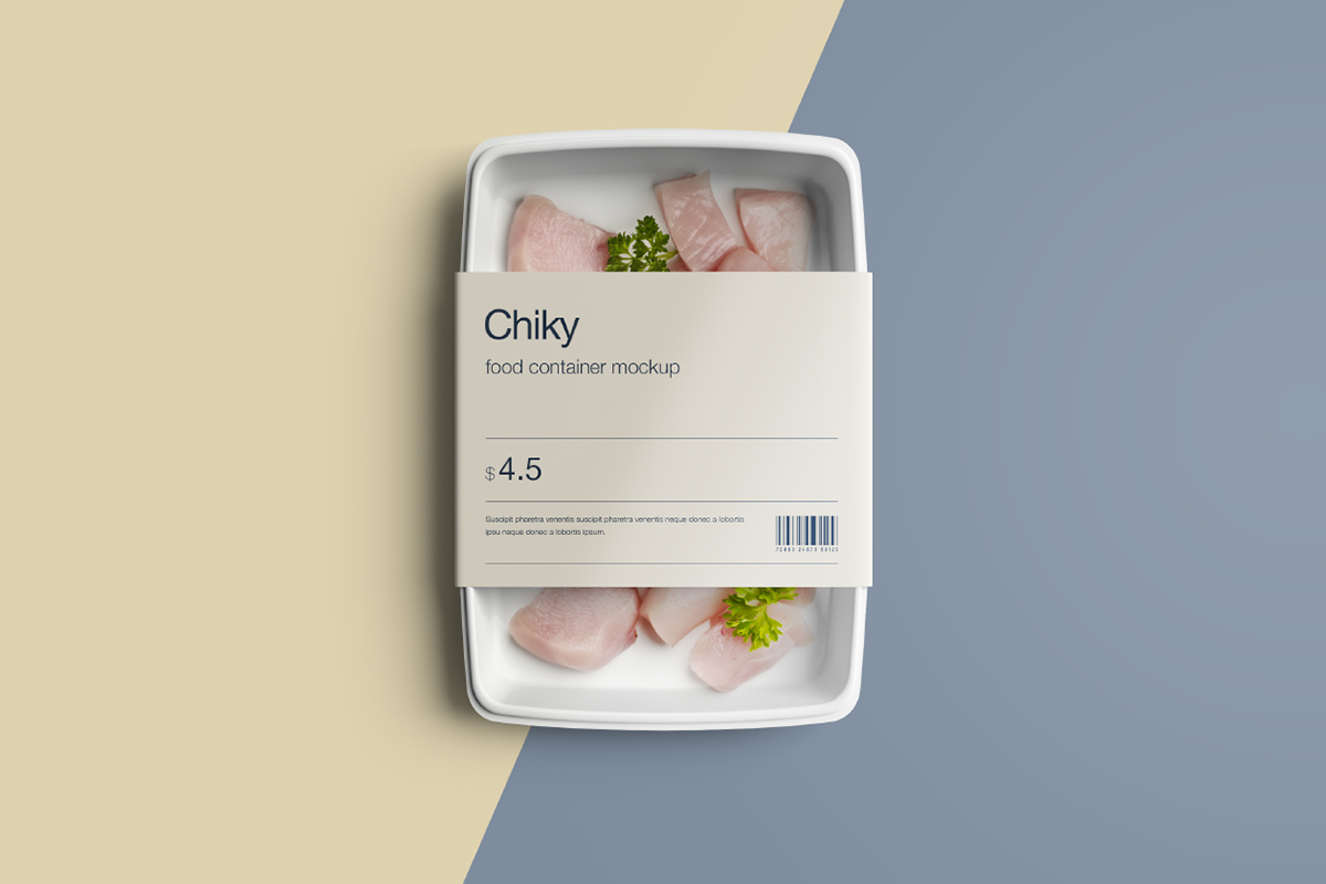
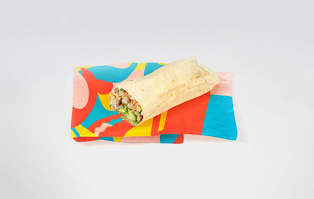
As there are no product shots yet, packaging and stationary outcomes have to be mockups. Whilst there are free mockups available online, I am going to create mockups from scratch to try and achieve a more authentic, professional brand proposal. The same colours, typefaces and patterns will be used for all of the mockups. This aims to keep consistency throughout the brand to ensure that it is memorable and professional in appearance. Outcomes will be produced in Illustrator to ensure that the artwork can be scaled to any desired size when physically produced.

Wednesday, May 9, 2018

OUGD603 - Brief 08 - Wrapsody - Digital Developments


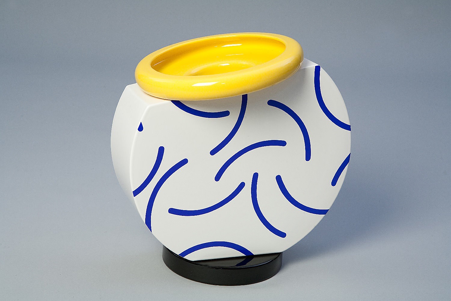
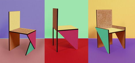
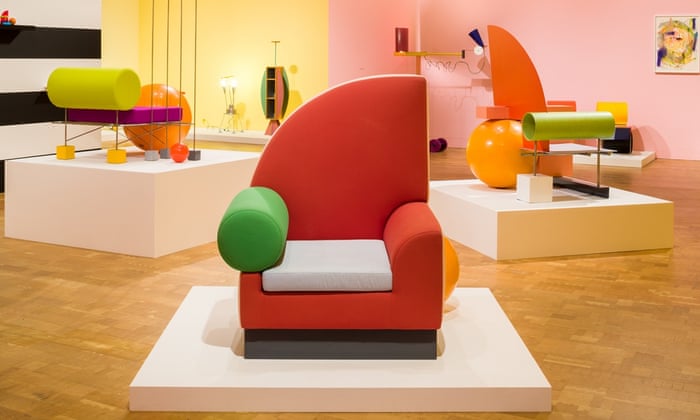
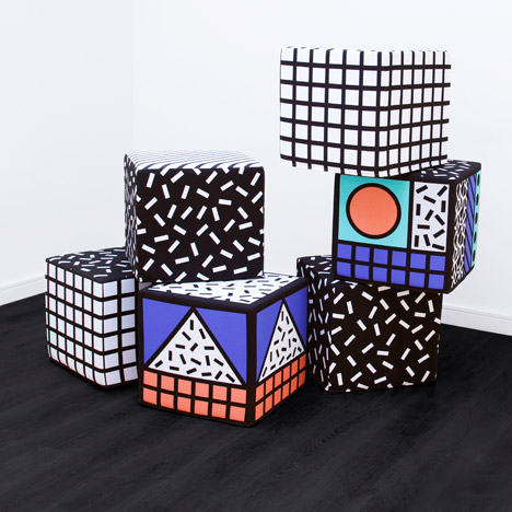
Colour  - Some visual imagery that inspired colour was as follows.


By looking at various Memphis Group interiors and product designs I have made a colour palette. It is very bright and colourful - an aspect that James wanted from the beginning of the brief. These 5 colours will inform following digital designs.


Typefaces - Following on from the agreed concept I have made some more visual research into 80s design. A site called 'Fonts in use' shows popular typefaces that have been used in music sleeve designs. This was interesting to look at due to the musical link of the word 'rhapsody'. By looking only at 80s sleeves a range of bold, header typefaces have been gathered that I will use for a logotype.


I got some feedback from a variety of young people - one of the main desired target audiences - to see which typeface they thought would be the strongest and most suitable for representing a food vendor. The typeface that was voted as being most appropriate was British Inserat MN. Uppercase was favoured as feedback highlighted it has a better impact for use as the large main logo.

Due to the large x-heights of letters it isn;t appropriate to use for body copy and smaller type. For this reason a secondary typeface needs to be found. British Inserat MN is a mono typeface; therefore, to keep consistency another mono typeface was found that is more legible at a small point size. PT Mono Regular was the most appropriate typeface found - it is a very clean serif typeface that provides great legibility, particularly in print where it would be used.


Imagery & Patterns
- As the agreed concept was to use ingredient shapes in an 80s style, I've made some research into imagery around ingredients. In the research stage I identified that many street food vendors use line vector illustrations. This is something that I want to avoid as I want to produce an outcome that is more unique. I've gathered a variety of royalty free silhouettes to use in the project.


The colour scheme made has been used to create a variety of pattern ideas. Two layouts work best - having silhouettes patterned with surrounding white space and silhouettes being laid on top of each other to create new shapes. These two patterns will be used to produce the final outcomes.