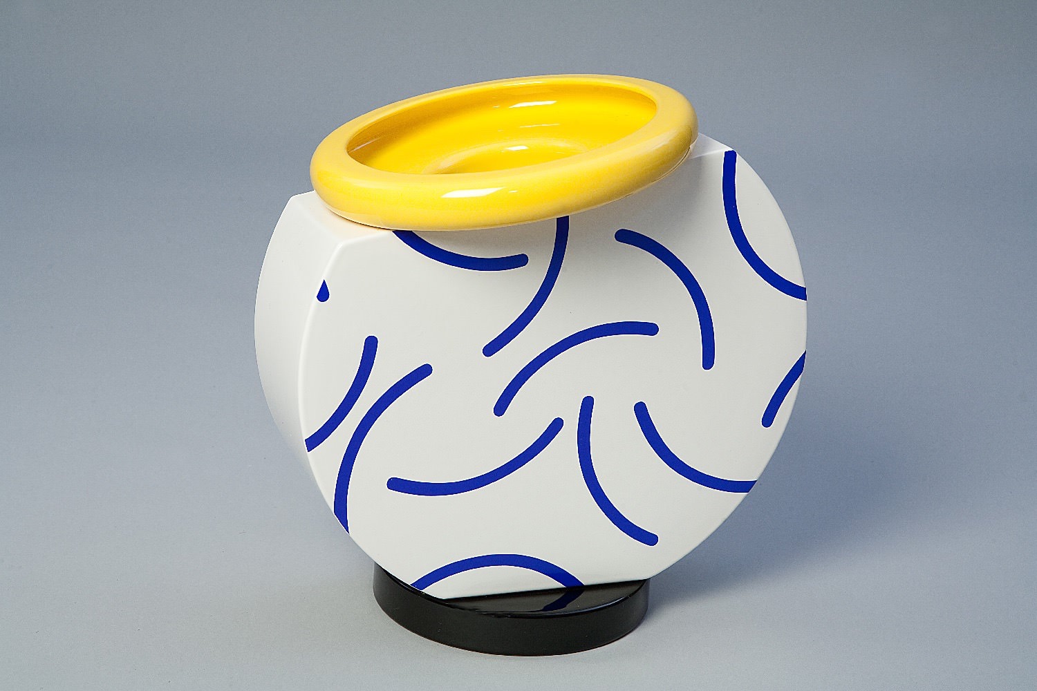
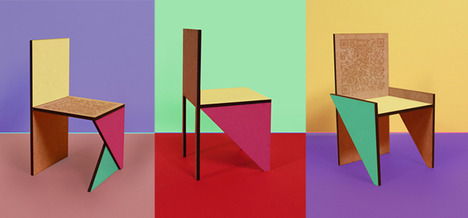
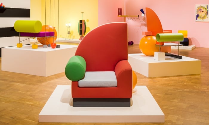
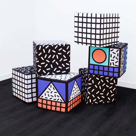
Colour - Some visual imagery that inspired colour was as follows.

Typefaces - Following on from the agreed concept I have made some more visual research into 80s design. A site called 'Fonts in use' shows popular typefaces that have been used in music sleeve designs. This was interesting to look at due to the musical link of the word 'rhapsody'. By looking only at 80s sleeves a range of bold, header typefaces have been gathered that I will use for a logotype.
I got some feedback from a variety of young people - one of the main desired target audiences - to see which typeface they thought would be the strongest and most suitable for representing a food vendor. The typeface that was voted as being most appropriate was British Inserat MN. Uppercase was favoured as feedback highlighted it has a better impact for use as the large main logo.
Due to the large x-heights of letters it isn;t appropriate to use for body copy and smaller type. For this reason a secondary typeface needs to be found. British Inserat MN is a mono typeface; therefore, to keep consistency another mono typeface was found that is more legible at a small point size. PT Mono Regular was the most appropriate typeface found - it is a very clean serif typeface that provides great legibility, particularly in print where it would be used.
Due to the large x-heights of letters it isn;t appropriate to use for body copy and smaller type. For this reason a secondary typeface needs to be found. British Inserat MN is a mono typeface; therefore, to keep consistency another mono typeface was found that is more legible at a small point size. PT Mono Regular was the most appropriate typeface found - it is a very clean serif typeface that provides great legibility, particularly in print where it would be used.
Imagery & Patterns - As the agreed concept was to use ingredient shapes in an 80s style, I've made some research into imagery around ingredients. In the research stage I identified that many street food vendors use line vector illustrations. This is something that I want to avoid as I want to produce an outcome that is more unique. I've gathered a variety of royalty free silhouettes to use in the project.
The colour scheme made has been used to create a variety of pattern ideas. Two layouts work best - having silhouettes patterned with surrounding white space and silhouettes being laid on top of each other to create new shapes. These two patterns will be used to produce the final outcomes.


No comments:
Post a Comment