Monday, October 31, 2016

OUGD503 - Studio Brief 01 - Major Brief - Research

Whilst I would usually research into various different areas, this brief was very limited in terms of the information given and possible research pathways. As a starting point, I looked back at some of the logos produced for previous live Bannenberg & Rowell projects in the past. Two of the logos that I produced were successfully accepted by the client and applied on the exteriors of the yachts. Considering these logos was important, because it reminded me of the process taken for both. For the 'Asya' boat, the brief simply stated that the client wanted an elegant logo to match the style of the boat. This was therefore very specific. As for the 'Promise' logo, I had no briefing as to what the client wanted. In this sense, a huge array of responses were made. In a way, this brief is a combination of the two. Whilst I know barely anything about the client or what type of logo they are after, I know that they are a shark enthusiast and that their previous yacht had a shark as part of its logo. Because of this, extensive primary research was made around the boat name - Megalodon. It was really important to understand what the name of the boat means to ensure that the outcomes produced are fully informed. 


Megalodons are an extinct species of shark that lived millions of years ago. The word means "big tooth" in ancient Greek, and they are notoriously known as the biggest shark to ever live. The boat has been named Megalodon in relation to this because it will be the biggest superyacht made in the world to date. As the yacht owner's previous boat logo was inspired by sharks, the Megalodon's form and visual characteristics were firstly analysed and noted before moving on to the idea generation process. Whilst the anatomy of entire Megalodons have never been physically analysed, they are believed to have the same general aesthetic features as Great White Sharks. Features, such as the shark's caudial fin, iconic dorsal fin, gill slits and elongated snout, were used to inform many obvious logo ideas in the following stage.

To inspire some more ambiguous ideas, less visually obvious aspects related to the Megaladon needed to be researched into. One discovered aspect is that they are believed to have the largest teeth of any shark, with five rows of over 270 sharp teeth that could grow to over 7 inches long and 4 inches wide. Bannenberg & Rowell informed me that the owner has a real Megalodon tooth fossil, and is a complete shark enthusiast. This was the only real piece of information that I was given about the client and his interests. For this reason, Megalodon teeth fossils were used to inspire and develop the early concept of incorporating a Megalodon tooth into a logo.

Another point was found that, like fingerprints and retinas are unique to each person, a dorsal fin is unique to each every shark. Each fin has scars, pockets and notches. Shark skin also has unique scars, which can be used to identify them. As the yacht itself is going to be unique in terms of the sheer size of it, it seemed fitting to incorporate a unique  aesthetic aspect into the idea process. Imagery of shark scars were gathered to use as a reference in the idea generation stage.

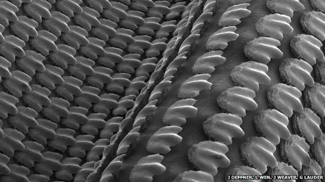
Whilst the scars on sharks are unique, their physical skin is unique too; shark skin is not made up of traditional fish scales, they rather have minature teeth, similar to shark teeth in general, that interlock. These scales are called "dermal scales". Up close photographs of shark skin are almost unidentifiable to the common aesthetic of shark skin. As some ambiguous logo ideas needed to be produced, these photographs presented an opportunity to hint at Megalodon sharks, by using detailed images of the skin as textures. 


To see whether there were any other existing superyachts that exist with the name 'Megaladon', further online research was made. No superyachts were found with the same name. One boat that was found however was one named 'Migaloo', which is Australia's greatest known whale. The page was labelled as a megalodon sub-marine yacht, most likely because of the size of the boat. The logo made for this yacht is very modern, minimal and simple. The 'A' has clearly been customized to resemble the fin of a whale. This is one example that inspired some of the more subtle ideas generated.

Carcharias was the clients previous yacht. As seen, the actual shark design is used in conjunction with a bold serif typeface. From analysing various superyachts and having worked with Bannenberg & Rowell before, it is clear that the common trend for yachts is to have either a purely typgraphic logo, or a symbol. Often, symbols will accompany the boat name. Furthermore, the yacht logo always tends to go on the rear end of the boat. These points were considered when developing initial ideas, to ensure that all outcomes made would be to a professionally appropriate standard.



Thursday, October 27, 2016

OUGD503 - Studio Brief 01 - Major Brief - Brief

The first brief that I have chosen to do is a freelance live brief. I have worked with Bannenberg & Rowell over the Summer break and last year, so am fairly acquainted with the area of designing logos for superyachts. Unfortunately, due to the confidentiality of this brief, I had to sign a non-disclosure agreement. I can show the design work that I have done; however, must not write the boat name or anything about the client when talking about the work. Pictures of the boat name can be used, as they do not appear on Google, but for text I have used 'M' when referring to the boat. The brief that I have been set is as follows:


Client - Bannenberg & Rowell

Brief - Produce a range of logo ideas for a new superyacht. The client has to be kept unknown; therefore, ideas should be based around the superyacht name. The owner's previous yacht logo was inspired by sharks, so try to produce a broad range of ideas that are similar and also different.

Response - As no background research can be made into the client himself, the easiest way to go about responding to the brief is to research into the name of the boat. As the client previously used a shark for a part of his ident, they will be a key focus. Previously, I have completed idents for two different boats. The briefs set were also very vague, with a lot of freedom to create a wide range of ideas. Most superyachts use either a full text logo or symbol, which is applied to the exterior and all other forms of branding. I will therefore produce a variety of ideas that can be presented to the client.


I am going to give myself three weeks to complete this brief. This will allow me to gather some appropriate research, generate a diverse range of ideas and receive feedback from the client and others to achieve a final outcome. Usually, the outcome required is a PDF with a variety of options. This will be sent to Bannenberg & Rowell, who will then present the ident proposals to the client.


Wednesday, October 26, 2016

OUGD504 - SB1 - A-Z: Type in Context - Final Design Refinements & Production


After making the adjustments raised in the test print stages, there were a few final design refinements and production considerations that needed to be considered.

Final Design Refinements - As flush left text was chosen over justified text, the right margins of paragraphs needed to be ragged, as a poor rag creates distracting shapes of white space in the margin. After changing the point size to 10pt, some lines had very bad rags. An example can be seen below. To fix this, the text on every page was manually ragged to ensure that all the paragraphs are easy to read, with a good rag that goes in and out from line to line in small increments.


When showing Simon the third test print, a few orphans were pointed out - orphans result in poor horizontal alignment at the top of the column or page, which is not desirable in publication design. For this reason, all the text was carefully reformatted to ensure there are no more orphans in the entire publication. The ragging of the text also had to be considered.

Once all the text and images were in place correctly, a final spelling check was made before exporting the InDesign document to a PDF. Bleed and crop marks were included so that the commercial printers would complete the job successfully.


Production - As highlighted in the test prints, the printers at uni are not accurate enough to print double-sided sheets on, as the spreads come out very inconsistently after being folded. For this reason, commercial printing was a more viable route to take. If this publication was actually going to be produced and distributed, more than 200-300 publications would be made. For this reason, the commercial printing route would be chosen, as it is cheap and consistent.

Unfortunately, there are no commercial printers in Leeds that allow reasonable one-off print jobs with custom stock. For this reason, G.F Smith paper, which was initially going to be sourced and used, could not be chosen. In place of the custom stock, I was offered 2 coated matt paper options, which felt as high in quality as the G.F Smith stock.

A heavier gsm was picked for the front cover to protect the inner pages and make the publication more durable. The inner page paper is much thinner to ensure that the publication is not too thick - if it was too thick it would not be able to close or lay flat, which was one of the design aims when staple binding was chosen.

The company required a PDF with a 3mm bleed, which I had already done. This made the process very quick and straightforward. The paginated PDF that I gave to them can be seen below.


The company provided a quick turnaround and the final publication was ready after just a few days.


Sunday, October 23, 2016

OUGD504 - SB1 - A-Z: Type in Context - Test Prints & Feedback

An initial test print was made to check for mistakes and see whether the overall layout physically works. This first test print can be seen below to the left. After receiving feedback from various people in the class, I asked Nick what he thought about the layout. He explained that the use of Tschichold's canon for margins is outdated and not relevant in magazines today. To highlight this, we analysed a variety of current magazines I brought in - all of which had equal outer margins and gutters. As my publication is trying to follow a similar aesthetic to the journals/mags analysed, this central page layout seemed a more appropriate to go down. The content was all adjusted to the new margins in InDesign and printed off once again. This second print can be seen below to the right. Everyone in the class preferred this layout, as the majority of comments received made clear that the initial layout felt too tight to the centre of the page.


After confirming the new layout, I showed Nick the 2nd test print to see what he thought. He raised one more point about the type size used - 12pt had been used for the body copy because it was found in the research stages that body copy should be 10-14pt in size (according to Indesign.com). However, Nick said that the point size for an A4 publication should not go over 9pt, as it is quite a mature book where oversized type would look quite amateur. In this sense, the type size had to be reconsidered.

For some further feedback, both Simons explained that 8-12pt should be used for A4 body copy. Once again, a few magazines provided a comparison with the 2nd test print. The type size in my print did look slightly too large in comparison. As it is difficult to tell when observing on screen, a 3rd test print was made, comparing type with 12pt and type with 9pt. All the feedback received suggested that 9pt, or 10 pt, would be most suitable for the publication. Therefore, all the type in the publication was re-sized and laid out again.


The printers at uni are unfortunately not very accurate when it comes to double-sided printing. The bleed and crop marks are printed a few mm off on each side, which causes the pages to misalign when trimmed and folded. As seen below, spreads either have gaps in the gutter or have areas where images have leaked onto the following page. There is no real way of getting round this at uni because all the printers are not very accurate. To get around this, commercial printing has to be considered, as the printers used can provide an accurate double-sided print that ensures there are no gaps or page misalignments.


The final choice in type, grids and page alignment can be seen below.


Saturday, October 22, 2016

OUGD504 - SB1 -A-Z: Type in Context - Page Order & First Test Print


After adding all the content the final PDF was ready for test printing. A large-scale photograph that has elements of the city and rural areas was chosen so that the front cover is not completely white; as mentioned in the design considerations stages, purely white book covers are a nightmare as they become marked and dirty fairly easily, which can prevent people from wanting to pick up the publication and read it. This image prevents the spine and majority of the front cover from being damaged in this sense.

Bleed marks and crop marks were added so that the pages could be cut out correctly. For test prints, the library printers were going to be used. This isn't very accurate but was a cheap, fast way to make some test prints.


Friday, October 21, 2016

OUGD504 - SB1 - A-Z: Type in Context - Layout Ideas & Implemetation

Before jumping into InDesign I looked at some existing spreads in various magazines and journals. These helped to inspire some layouts for my own publication. The rough sketches made can be seen below. Due to the target audience chosen earlier in the project, it was decided that the photographs need to be more prominent than the text, so that people who are not interested in design can flick through the book and get a gist of the culture/environment. For this reason, the layout sketches made tried to put a focus on large scale images and minimal text.


Before agreeing on the layouts that would be used, consistency needed to be ensured across the entire publication. For this to successfully happen, a custom grid was made in InDesign. At first, a simple 6:18 grid was made. This particular size was chosen because 2:3 proportions are good proportions for books (Tschichold). Whilst this allowed the two paragraphs of text to have fairly optimum character lengths - on average 50 characters - the gap between the paragraphs of text and image above felt too wide. Furthermore, the gap between the two paragraphs of text was too tight when the boxes were aligned with the grid. These two conflicting gap sizes were aesthetically ineffective.

For this reason, a much more complex grid was used. Whilst it may look overcomplicated, the closer intervals between columns and vertical grid lines allowed a better template to positions text and images in. This grid size also allowed a consistent gap size between images and paragraphs too (identified by the green area).


With the custom grid being applied to all pages in the document, the sketched layout ideas were quick and easy to create. After experimenting with all the layout ideas made, the 6 layouts, seen below, were chosen for use in the final publication. There was various reasons for this; firstly, having 6 various layouts rather than just one allows much more variety throughout the publication, which aims to keep reader more engaged and interested in the content. All the layouts are consistent - the type and images all conform to the grid. Paragraphs all have an optimum character line length, which is crucial for easy readability, and a combination of vertical/horizontal image frames have been used to suit the variety of photographs taken.

The 2 layouts to the right are for environmental/full-scale images of the journey only. These are dividers that will break up the publication, so that the editorial layouts do not get overly repetitive.


The main challenge after choosing these layouts was how to order the pages in a way that works aesthetically and in term so of the content. As the trip was very sporadic in terms of places visited, a contents page seemed inappropriate. The majority of signage analysed was in the city centre, as there wasn't as much interesting signage to analyse in more rural areas. Because of this, it was too difficult to divide the publication into sections. Instead, a more random page order was used to tie in the nature of the journey itself.

Rather than a contents page, I wrote a short summary that highlights what the publication is about, including the places visited and what the content is about. Both target audiences were considered carefully so that the introductory text did not come across as just design-specific. One of the editorial page layouts was used for this page too to keep consistency with the rest of the publication.


The only stage left was to put all the chosen content in and ensure the publication worked as a whole. Some content and images needed to be re-edited; for the photographs, some did not work with others on the same spread, so adjustments were made in Photoshop to ensure that spreads worked effectively. For the content, more information was added about the journey itself, covering environmental and cultural areas.


Wednesday, October 19, 2016

OUGD503 - Studio Brief 01 - Brief Analysis & Initial Selection

This module focuses on responding to live briefs. When choosing briefs, the following needs to be considered:

How do you balance what you want to do, design or produce with what the brief requires?
Do the briefs offer enough breadth and scope for the development of a range of responses whilst at the same time allowing you to focus your practice?
What are the realistic timescales for completing the brief? Are you working to these?
Have you clearly identified what the problem is before you start?
Where is the challenge in the brief and what will you get out of doing it?
What do you need to present and how will you present it?

To make this module link in with my developing practice, I have tried to select briefs that are relative to the area of work I would like to pursue. As well as this, the amount of work and time each brief would take has been considered, as 1 substantial brief and 2 smaller briefs should be undertaken. The briefs that stood out to me are the following:


Secret 7 - After sadly not getting into the competition last year, I want to submit again with a much different approach. Last year, I tried experimenting with as many physical processes as possible. Whilst this produced a wide range of outcomes and helped me to develop some practical skills, the outcomes did not look that professional. This year, I would like to take a more digital approach, as this is the main style I want to pursue in my career (apart from producing publications).

Last year, it was considered as a substantial brief; however, I feel that the timescale this year should be fairly short, as there are a lot of different pathways that can be taken when responding to a song in a short amount of time. In terms of the responses to this brief, I do not want to limit myself. However, I would like to incorporate some 3D work into the outcomes as it is one area that I want to develop throughout this year.


D&AD New Blood Awards - Hasbro Brief

As a family friend created the board game 'Cranium', I have always wanted to produce a game to see if anything could be done with it. Completing such a brief for D&AD would allow me to experiment with game design, and would give me more confidence in potentially getting in touch with my contact.

Party games encompass packaging design, branding and concept consideration, which are all areas that I thoroughly enjoy.  This is therefore one brief that I would definitely like to pursue.


Tuesday, October 18, 2016

OUGD504 - SB1 - A-Z: Type in Context - Typography

Mentioned earlier in the project, a combination of serif and sans-serif typefaces will be used, as the photographs in the publication highlight a mixture of serif and sans-serif typography.

After analysing various publications it became clear that using a bold, larger point sized sans-serif typeface for headers and a thinner, less prominent serif typeface for body copy is a very popular trend. Therefore, to follow this trend two main typefaces were chosen:


Helvetica was chosen for the header text because of various reasons. At the start of the trip, I flew from Heathrow airport, where Helvetica was used to clearly identify the numerous gates. As Helvetica was photographed before any other type on the journey, it seems appropriate to use for headers, as those reading the journal will also see the typeface before any others. This almost brings my experience on the trip to the reader, through the subtle use of typography.

Alongside this reasoning, Helvetica has many other characters that make it effective for headers. It has monotone stroke weights, making words very easy and consistent to read. Furthermore, it remains legible when in motion, which is quite useful for people who are reading the journal on-the-go.


For the body copy, Adobe Caslon Pro Regular was picked. This was inspired by Sarah Le Donne's Bus Journal publication - a similar serif typeface was used for paragraphs and body text in her work.

Caslon was one of the closest typefaces to this example. It has many characteristics that make it perfect for body copy, including superior legibility, beautiful curves and lines with varied weight and tension to keep engagement. Whilst Caslon has been used in a lot of historic documents, it has been used in many modern books for paragraphs of text; as my publication has quite a lot of written content, it is definitely appropriate to use.

The sizing and leading of the body copy type was determined by Butterick's Practical Typography Rules, where they state that type should be 10-12pt in printed documents. A type size of 12pt was therefore used in my publication.

For the leading of the body copy text, Butterick also highlight that line spacing of 120%-145% should be used for optimum readability. To calculate the leading needed, I multiplied 12pt by 1.33 to get 16pt.


As the body copy text was now confirmed, the header had to be correctly sized. Vignelli highlights that 'we like to play off small type with larger type - usually twice as big' in the Vignelli Canon. As Helvetica has a different x-height to Caslon, the point size could not be calculated accurately by simply doubling the body copy text size. Instead, I followed Vignelli by making the header text the same size as two lines of the correctly-leaded body copy text. The resulting size was 34pt for the header, where the leading calculates to 40pt.


Sunday, October 16, 2016

OUGD503 - Studio Brief 01 - Responding to a Brief


There are many different ways of researching when it comes to responding to a brief. As an example, below are some pathways that could be chosen if faced with designing a book cover for a Penguin book:

◦ Look at the history of Penguin, their book covers and which ones were more effective than others.
◦ Compare their recent covers to other existing publishers - what is a current theme? What makes the book stand out?
◦ Look into previous winners and see how they worked towards a final outcome. Also, look at previous entries that didn’t win - try to understand why they didn’t in comparison to the winners.
◦ Research into the judges and their respective backgrounds.
◦ Read the book - This way, a unique concept could be created that is relative to the book and characters. This could be much more successful and appropriate than someone’s response who have not read the book.
◦ Try and find out about what the author’s intentions were then they wrote the book. What are the main themes and their influences?
◦ Consider the target audience of the book and who the design should appeal to.
◦ Consider the tone of voice of the book. This can inform the aesthetic taken.


To try and consider how YCN winners reacted and researched after receiving a brief, I have considered the points mentioned above.

Brief - Design a marketing tool to promote the new Fedrigoni range of uncoated black papers and boards: Sirio Ultra Black - one of the darkest papers on the market.

Concept - A direct mail piece showcasing the first manned descent into the Marianas Trench - the deepest point in the world’s oceans, and the darkest place on Earth. The package includes a laser cut representation of the Trench, a poster and a book. The piece allows links to be made between the historical event and the paper’s qualities. Not only does it demonstrate the potential of what can be done with the paper, with techniques such as embossing and foiling, but also inspires the designer, encouraging a sense of curiosity and discovery.

Evidently, their main response came from the fact that Fedrigoni say they have the blackest paper out there. For the research stages, they clearly looked into aspects that relate entirely to the darkness and richness of paper. The main idea that came from this was to make a package based on an expedition that goes down to the deepest point on Earth below the sea (the Mariana Trench). The package includes a laser cut representation of the Trench, a poster and a book, which all ties in to the original starting point that the paper is the blackest out there.

The concept directly informed the content in the publication; an illustrator collaborated with two graphic designers to put together a publication about the Mariana Trench and fish that live in it. This concept has clearly won because of the pure creativity put into the response; going from a fairly vague brief to creating something so conceptual and well-related is tough, but very rewarding. When facing briefs of my own, I will have to consider the importance of the concept and to think outside the box. Some of the main consistencies of winning work are the following:

◦ Nothing is open to interpretation.
◦ Campaigns - outcomes are very concept driven and innovative.
◦ The work is placed in context and is very simple/clear (KISS).
◦ The finishing and presentation of the work is to a very high standard.
◦ D&AD winning entries feel more like commercial responses, whilst YCN winners are more hypothetical.


Saturday, October 15, 2016

OUGD504 - SB1 - A-Z: Type in Context - Binding & Stock Choice

Binding - The choice of binding really needs to be considered before designing the publication, as it will inform the size of page margins and therefore the entire page layout. I have analysed a variety of binding options to decide what would suite my publication the most.

Perfect Binding

This is the most used binding choice when it comes to books with a lot of content, mainly because of the fact that it is very strong and durable. One problem with perfect binding is the fact that it never lays flat. This is not so much a problem when reading a book full of text, as the scale of the book is small and easy to stretch out.

However, when the page size is A4+, perfect bound books can be extremely irritating to hold and read, as the pages constantly fold in, making central information disappear in the gutter. The collaboration publication that I made with Elliott had this problem - the publication was thin overall, but the pages would not lay flat, making the central content very difficult to read. This would be very problematic for my publication, as I want to highlight large images across double pages. When perfect bound, the image becomes slightly broken up due to the protruding central crease. Therefore, in this use of a traditional perfect binding is not appropriate.

Case Binding

This is a form of perfect binding that allows the pages to lay flat. The pages are bound in half to two inner headbands, which makes the gutter contents much more visible. In one essence, this binding would be perfect for a coffee-table book; however, the publication that I am producing is aimed to be more of a magazine that is lightweight and easy to bring around with you for leisurely reading than one you sit at a table and read. All the really touristy travel guides that I analysed were hardback, perfect bound books, which is one aesthetic that I do not want the publication to follow. For these reason, both forms of perfect binding are not really suitable for the concept and aims I have.

Saddle Stich Binding

This binding method is usually considered as being the most cheap, lazy production method to use when done incorrectly. Ineffective pieces of work tend to misjudge the positioning of staples and others can have loose staples that lead to the pages falling out of the spine. In some instances, however, the use of staple binding can be extremely successful, aesthetically and production wise.

This copy of Law Issue 7 uses two staples to hold the entire publication together. Fairly dark photographs have been printed on the back cover, middle pages and spine to ensure that the staples are barely even visible. As evidenced in the photographs taken below they are very difficult to see, even when held under a bright light. This careful consideration highlights how staple binding can be used effectively and subtly.


There are two main benefits to staple binding. The first is that the publication can lay flat if there is a fairly small number of pages. As mentioned when analysing the previous binding methods, this is an aspect that is important for my publication. The second main plus side to this method is the fact that it is extremely cheap to produce a single publication, or mass-produce hundreds. Staple binding machines are extremely efficient and can easily turn out hundreds of publications in one day. This would be crucial if I wanted to produce and sell a lot of copies.

Coptic Binding

This binding method uses thread to stitch the folded pages together. One main benefit is that, similar to staple bound books, the pages lay completely flat. However, unlike staple bound books, every page can lie perfectly flat, rather than the centre two.

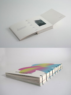
This binding is much more apparently visible than staple binding. The example seen on the left uses black thread that is extremely prominent over the spine. Whilst it can look subtle with lighter coloured thread, the overall aesthetic somewhat resembles a diary or planner, as many of these have ring-bindings which look fairly similar. This is not really the aesthetic I want to give, as I want the book to identify more as a leisurely reading magazine than a diary to write in/planner. Although, this aesthetic may not be as evident when there are a lower number of pages bound.

Final Binding Choice

The main decision to make was whether to choose coptic binding or staple binding. To make a judgement, I considered which method would be more appropriate when producing more than one copy. As the brief states that I should consider the publication in terms of it being sold, I have thought about the production efficiency of both methods. Whilst coptic binding is aesthetically cleaner than using staples, it would take far too long to produce hundreds of publications, as the stitching must be done by hand which is very tedious and very expensive. Staple binding machines, on the other hand, make the production process extremely fast and easy. The process is also very cheap, which is essential when producing a large amount of copies, and it is very unnoticeable when done correctly.


Stock Choice - Because one of the target audiences chosen for this publication is creatives, the stock chosen must be to a high-quality. As a budding graphic designer, I have learnt that a cheaply produced publication with poor quality stock gives an immediately bad impression. It takes away the tangible side of the experience, which is one of the most crucial aspects to physically producing a book. To ensure that the publication is to a very high-quality standard, I have chosen to use the renown paper smith G.F Smith to source a wide variety of paper. Before ordering samples, I thought about the following points very carefully:

◦ White Covers - Simon mentioned the other day that entirely white covers are a nightmare, due to the fact they can become marked and appear dirty after a fair bit of use. This is backed by Jan Tschichold where he statest that 'white book covers... [are] about as delicate as a white suit' (The Form of the Book). To avoid this, I am going to either use a different coloured stock for the cover of the publication, or, I am going to use white stock and print a colour/image on it, so that the main colour showing is not white. I used white stock last year for the colour theory publication and the spine was almost grey after being handed around in a crit.

◦ Coated/Uncoated & Diversity - The main aspect that makes a book so special is the tangibility of it - what stock has been used and how all the pages work together in harmony. Rather than choosing one type of stock for this publication, I am going to try and use 2 or 3 different types of paper, to create a variation in colour, feel and weight. In Basics Design 02: Layout, Gavin Ambrose and Paul Harris state that 'gloss is considered better suited to full-colour reproduction of images, but it's shine can interfere with the readability of the text. For this reason a matt stock offers a workable compromise when reproducing both image and text'. For the pages in my publication that combine text and images, I will use matt stock, as readability is very important. For full scale photograph pages that will break up the publication and possibly be used on the cover, I may use paper with a glossy finish, as photographs tend to print with more richness on a heavier coated paper. As the publication would be sold for a fairly high price, it should be fairly water resistant and durable. In this sense, uncoated paper is unsuitable for the publication, as it is susceptible to water damage and being marked easily.