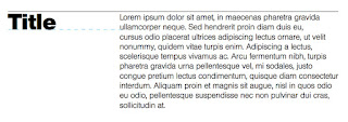
After analysing various publications it became clear that using a bold, larger point sized sans-serif typeface for headers and a thinner, less prominent serif typeface for body copy is a very popular trend. Therefore, to follow this trend two main typefaces were chosen:
Helvetica was chosen for the header text because of various reasons. At the start of the trip, I flew from Heathrow airport, where Helvetica was used to clearly identify the numerous gates. As Helvetica was photographed before any other type on the journey, it seems appropriate to use for headers, as those reading the journal will also see the typeface before any others. This almost brings my experience on the trip to the reader, through the subtle use of typography.
Alongside this reasoning, Helvetica has many other characters that make it effective for headers. It has monotone stroke weights, making words very easy and consistent to read. Furthermore, it remains legible when in motion, which is quite useful for people who are reading the journal on-the-go.
Alongside this reasoning, Helvetica has many other characters that make it effective for headers. It has monotone stroke weights, making words very easy and consistent to read. Furthermore, it remains legible when in motion, which is quite useful for people who are reading the journal on-the-go.
The sizing and leading of the body copy type was determined by Butterick's Practical Typography Rules, where they state that type should be 10-12pt in printed documents. A type size of 12pt was therefore used in my publication.
For the leading of the body copy text, Butterick also highlight that line spacing of 120%-145% should be used for optimum readability. To calculate the leading needed, I multiplied 12pt by 1.33 to get 16pt.

As the body copy text was now confirmed, the header had to be correctly sized. Vignelli highlights that 'we like to play off small type with larger type - usually twice as big' in the Vignelli Canon. As Helvetica has a different x-height to Caslon, the point size could not be calculated accurately by simply doubling the body copy text size. Instead, I followed Vignelli by making the header text the same size as two lines of the correctly-leaded body copy text. The resulting size was 34pt for the header, where the leading calculates to 40pt.
For the leading of the body copy text, Butterick also highlight that line spacing of 120%-145% should be used for optimum readability. To calculate the leading needed, I multiplied 12pt by 1.33 to get 16pt.

As the body copy text was now confirmed, the header had to be correctly sized. Vignelli highlights that 'we like to play off small type with larger type - usually twice as big' in the Vignelli Canon. As Helvetica has a different x-height to Caslon, the point size could not be calculated accurately by simply doubling the body copy text size. Instead, I followed Vignelli by making the header text the same size as two lines of the correctly-leaded body copy text. The resulting size was 34pt for the header, where the leading calculates to 40pt.


No comments:
Post a Comment