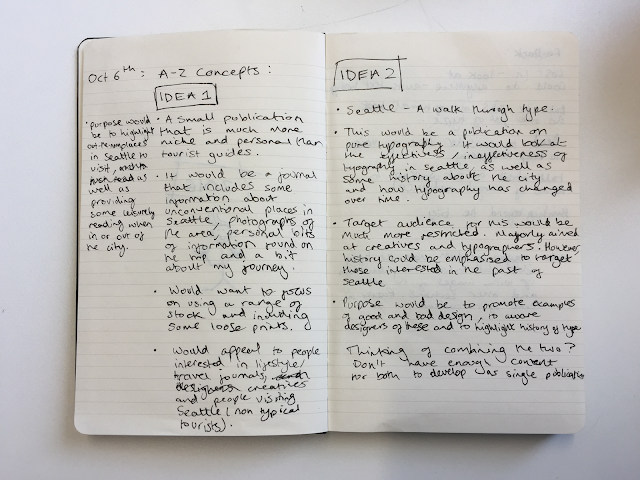
After researching into existing books/publications and gathering all the necessary images and content together I can now start to think about the direction of my publication. The concept, purpose and target audience are key factors that must be decided on before even considering the design treatment. Some pros and cons for each idea have been considered.

Idea 1 - The main concept for this first idea is to produce a travel journal that includes some information about unconventional places in Seattle, photographs of the area, bits of information that I found on the trip and a bit about my journey. The publication would be much more niche and personal than the researched tourist guides. Most tourist guides talk about the most popular attractions in cities, which is useful but can become slightly dull to read. This concept would almost cross travel magazines like Lost In with lifestyle magazine such as Cereal. This would be less tourist-based and would focus more on showcasing some of the out-of-the-norm places in Seattle.
Pros:
◦ The target audience is quite wide compared to the other idea, which is good in the sense that there are more possibilities when it comes to designing the publication.
◦ I could research and learn even more about Seattle and the surrounding area.
◦ This idea would allow me to showcase some of the photographs I took on the trip that are completely unrelated to typography.
Cons:
◦ The content written over summer focuses solely on typography and signage, therefore a lot more written work would have to be done.
◦ I only have a small amount of images that would work in this concept - the publication would have to be very small.
Idea 2 - The main concept for this idea is to produce a book that analyses effective/ineffective signage in Seattle. Some history about Seattle and how type has changed would be one aspect to the publication, whilst American culture and design related to the type analysed would be another. The content that I have already written purely analyses the signage I saw in Seattle, therefore it would be much easier and faster to produce than the other idea in terms of the written content. I will have to write more about the history and context of the signage however.
The target audience for this idea would be much more restricted than the first idea. It would mainly have to be aimed at designers and creatives that are interested in typography. Depending on the tone of voice it could be marketed as a guide to successful typography, thats purpose is to aware students studying design about effective/ineffective typography. Another purpose could be to promote the local area of Seattle through its design and signage. Both were considered and put forward in the crit.
Pros:
◦ The analysis of signage needed for the content has already been written, therefore I could begin laying out the text straight away.
◦ There is roughly 2 or 3 photographs of signage for each letter, which will allow a diverse variation and variety in image orientation.
◦ Whilst the target audience is less wide than the first concept, it means that I could focus the design to target a specific area of people.
◦ The target audience is very specific and less wide than the first concept. This is fairly more restricting than the first idea, which is one negative aspect.
Feedback - The main feedback gained from the crit was whether to choose one idea or combine the two into an overall concept. The majority of people leaned towards the first idea as they thought it sounds more interesting; however, there were quite a few suggestions to combine the two after I explained that I don't have enough non-type related images to do the first idea alone.
Luke mentioned a really important point; as he has read through some of my content already, he highlighted that I will need to consider the tone of voice if combining both concepts, as some content relative to the first idea is more comical than the content written for just signage. This is definitely one aspect I need to focus on because there needs to be a clear, consistent tone of voice throughout the publication.
John made a point that I should look further than just the publication and see how a concept could work as a set, rather than just one outcome. For this, I am going to have a think about how I could expand the concept into outcomes wider than just a book about type/Seattle.
People really liked the photographs taken; they thought that the way they have been edited as a set will give the publication a very consistent look, image wise. This was one aim made in the development of my content, therefore it was good to see that people picked up on the chosen aesthetic direction of the photographs.
Overall, the crit session really helped to identify the pathway I should follow. I will produce a time plan in the following blog, as well as a thoroughly explained final concept.


No comments:
Post a Comment