 Perfect Binding
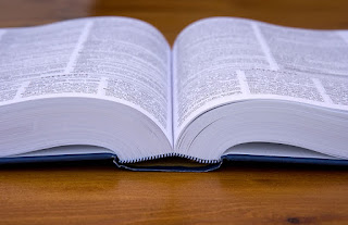
This is the most used binding choice when it comes to books with a lot of content, mainly because of the fact that it is very strong and durable. One problem with perfect binding is the fact that it never lays flat. This is not so much a problem when reading a book full of text, as the scale of the book is small and easy to stretch out.
However, when the page size is A4+, perfect bound books can be extremely irritating to hold and read, as the pages constantly fold in, making central information disappear in the gutter. The collaboration publication that I made with Elliott had this problem - the publication was thin overall, but the pages would not lay flat, making the central content very difficult to read. This would be very problematic for my publication, as I want to highlight large images across double pages. When perfect bound, the image becomes slightly broken up due to the protruding central crease. Therefore, in this use of a traditional perfect binding is not appropriate.
Case Binding
This is a form of perfect binding that allows the pages to lay flat. The pages are bound in half to two inner headbands, which makes the gutter contents much more visible. In one essence, this binding would be perfect for a coffee-table book; however, the publication that I am producing is aimed to be more of a magazine that is lightweight and easy to bring around with you for leisurely reading than one you sit at a table and read. All the really touristy travel guides that I analysed were hardback, perfect bound books, which is one aesthetic that I do not want the publication to follow. For these reason, both forms of perfect binding are not really suitable for the concept and aims I have.
Saddle Stich Binding
This binding method is usually considered as being the most cheap, lazy production method to use when done incorrectly. Ineffective pieces of work tend to misjudge the positioning of staples and others can have loose staples that lead to the pages falling out of the spine. In some instances, however, the use of staple binding can be extremely successful, aesthetically and production wise.
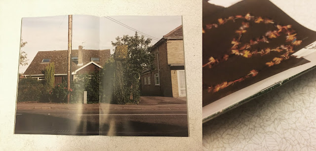
This copy of Law Issue 7 uses two staples to hold the entire publication together. Fairly dark photographs have been printed on the back cover, middle pages and spine to ensure that the staples are barely even visible. As evidenced in the photographs taken below they are very difficult to see, even when held under a bright light. This careful consideration highlights how staple binding can be used effectively and subtly.

There are two main benefits to staple binding. The first is that the publication can lay flat if there is a fairly small number of pages. As mentioned when analysing the previous binding methods, this is an aspect that is important for my publication. The second main plus side to this method is the fact that it is extremely cheap to produce a single publication, or mass-produce hundreds. Staple binding machines are extremely efficient and can easily turn out hundreds of publications in one day. This would be crucial if I wanted to produce and sell a lot of copies.
 Coptic Binding
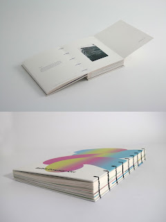
This binding method uses thread to stitch the folded pages together. One main benefit is that, similar to staple bound books, the pages lay completely flat. However, unlike staple bound books, every page can lie perfectly flat, rather than the centre two.
This binding is much more apparently visible than staple binding. The example seen on the left uses black thread that is extremely prominent over the spine. Whilst it can look subtle with lighter coloured thread, the overall aesthetic somewhat resembles a diary or planner, as many of these have ring-bindings which look fairly similar. This is not really the aesthetic I want to give, as I want the book to identify more as a leisurely reading magazine than a diary to write in/planner. Although, this aesthetic may not be as evident when there are a lower number of pages bound.
Final Binding Choice
The main decision to make was whether to choose coptic binding or staple binding. To make a judgement, I considered which method would be more appropriate when producing more than one copy. As the brief states that I should consider the publication in terms of it being sold, I have thought about the production efficiency of both methods. Whilst coptic binding is aesthetically cleaner than using staples, it would take far too long to produce hundreds of publications, as the stitching must be done by hand which is very tedious and very expensive. Staple binding machines, on the other hand, make the production process extremely fast and easy. The process is also very cheap, which is essential when producing a large amount of copies, and it is very unnoticeable when done correctly.
Stock Choice - Because one of the target audiences chosen for this publication is creatives, the stock chosen must be to a high-quality. As a budding graphic designer, I have learnt that a cheaply produced publication with poor quality stock gives an immediately bad impression. It takes away the tangible side of the experience, which is one of the most crucial aspects to physically producing a book. To ensure that the publication is to a very high-quality standard, I have chosen to use the renown paper smith G.F Smith to source a wide variety of paper. Before ordering samples, I thought about the following points very carefully:
◦ Coated/Uncoated & Diversity - The main aspect that makes a book so special is the tangibility of it - what stock has been used and how all the pages work together in harmony. Rather than choosing one type of stock for this publication, I am going to try and use 2 or 3 different types of paper, to create a variation in colour, feel and weight. In Basics Design 02: Layout, Gavin Ambrose and Paul Harris state that 'gloss is considered better suited to full-colour reproduction of images, but it's shine can interfere with the readability of the text. For this reason a matt stock offers a workable compromise when reproducing both image and text'. For the pages in my publication that combine text and images, I will use matt stock, as readability is very important. For full scale photograph pages that will break up the publication and possibly be used on the cover, I may use paper with a glossy finish, as photographs tend to print with more richness on a heavier coated paper. As the publication would be sold for a fairly high price, it should be fairly water resistant and durable. In this sense, uncoated paper is unsuitable for the publication, as it is susceptible to water damage and being marked easily.


No comments:
Post a Comment