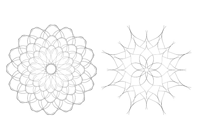
In a crit group, I initially presented the mandalas made and asked people to pick their personal favourite patterns, and patterns that make them feel the most relaxed. This was done unanimously to ensure that personal responses were made. Out of the ideas presented, the two highest-voted patterns can be seen on the right. As this was completely subjective, it was difficult to see why people had chosen these two. The majority of feedback received highlighted that these had been picked mainly because of their floral aesthetic and curved nature.
Some people in the crit suggested that I layer the patterns, to make the designs slightly more detailed and intricate, as it was said that the patterns are too simplistic, with too much white space, making the colouring process rather dull. To respond to this, the patterns were layered in Photoshop. This creates a much more detailed mandala that has different segments and depths to colour in.

As a final stage in the process, another crit group with different people was set up. In this crit, I wanted to see which illustrations people thought are the more appropriate for the colouring book - the mandalas or the water lilies. Overall, the majority of feedback leaned more towards the water lilies. Many people really liked the visual look of the mandalas, and thought that they would be relaxing to colour in; however, many thought that the use of mandalas is generic and not very original. One person googled 'adults colouring book for adults' and found a wide variety of already-made mandalas. A screenshot can be seen on the right. People also thought that the water lily drawing would work better on an A3 page, as it is much wider than the mandala illustrations. For these reasons, the water lily illustration was chosen to use as a more appropriate final submission.
The brief asks for a couple of sentences to be included in the piece. For this, I included my own personal opinion and some positive information about water lilies:
'Water lilies are a symbol of optimism, peace, purity and spiritual enlightenment. I find them to be relaxing because they are naturally very tranquil'.
As the client will most likely select a typeface to use for the entire book, minimal time was spent on selecting one. Din Light was used because it has the same line width as the illustration, ensuring a consistent overall aesthetic. It is also very legible when at a small scale. Flush left type was chosen, following Vignelli's point that centred and justified type is not as appropriate. The final layout of the A3 page can be seen to the right. Some mockups of the outcome were made on some basic A3 books.


No comments:
Post a Comment