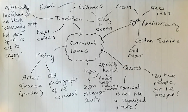
To generate some poster ideas I read through the research made and created a quick mind map of possible directions that could be taken. This can be seen below. The mind map was used to inspire a variety of intial poster ideas. At this stage in the process, ideas focused more on the concept than quality of visuals. As the Carnival is open to all people to enjoy - not just West Indian people - I was able to present my ideas to a small crit group of students to see which ideas they thought are the most celebratory and appropriate for the Carnival.

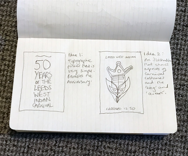
The first two ideas focus on celebrating the fact that it is the 50th Anniversary of the Carnival. The first sketch highlights how a purely typographic poster could be produced, advertising the anniversary as simply and clearly as possible, whilst the second sketch highlights how aspects of the Carnival, such as costumes and 'Kings' and 'Queens', could be combined together to produce an illustration/symbol that can be used to represent the 50th Anniversary. People in the crit liked the second sketch much more than the first; much of the feedback given was that the illustration/symbol produced has a lot more character to it, whereas a purely typographic poster would not promote the qualities of the Carnival as effectively. People suggested that I develop the illustration made and combine it with some typography, to create a composition that is both symbolic and informative. This led to the first digital poster being later produced.

The second two ideas are less focused on celebrating the 50th Anniversary, and are more focused on aspects of the Carnival itself. The first sketch highlights how the poster could show a timeline of the Carnival, displaying historic events that have occured since its establishement; whilst, the second sketch highlights how the poster could be much more ambiguous, simply taking a variety of exotic colours seen at the Carnival and using them as the main focus of the poster. In the crit, many people preferred the ambiguity of the second sketched idea, as the rest of the ideas created are quite obvious in relation to the imagery and content used. Whilst people thought that the timeline idea would be very interesting to read, much of the feedback highlighted that people thought it would be too detailed and text-heavy, as the history of the Carnival is extremely extensive. For this reason, the ambiguous use of colour idea was later developed into a digital poster.
The last main idea was to make use of some of the quotes and old Carnival photographs found in the research stage to promote the qualities and aims of the event. A few quick mockups of this idea were made to highlight how the quotes could be combined with old photographs found. Informed by the research made, only positive imagery was used to follow the theme of the Carnival's previous posters. Yellow type was used to link the message to the 50th Anniversary (through the Golden Jubilee reference). People thought that this was the most celebratory idea out of those presented, as the use of old Carnival photographs and quotes visually highlight the tradition and culture behind the Carnival. 'By the people, for the people' was considered as a much more appropriate tagline to use than 'Carnival is not just a legalised rave', as people said that the message is more unifying and less about addressing a negative viewpoint against the Carnival. I wanted to see whether people thought a landscape orientation could work for the final print; however, people suggested that I should stick to portrait, as almost every poster that will be shown in the exhibition will be in this format. For this reason, I chose to develop the 'By the people, for the people' idea in a portrait orientation, using the same photograph chosen of Arthur France celebrating the Carnival.


No comments:
Post a Comment