As a starting point, the research made into calming colours was used to begin considering what illustrations could focus on. A list of things associated with the 5 identified calming colours - pink, yellow, green, blue and violet - was made. This can be seen on the right. The main idea behind this was to try and ensure that the user would be colouring in something with colours that are stress-relieving. Whilst this can not be exactly predicted, using obvious colour-related things, such as the sea being blue, and flamingos being pink, creates a higher chance that the user will colour in the illustration with calming colours. As it was found that a lot of relaxing images focus on nature and animals, a lot of the things included in the list focus on such aspects.
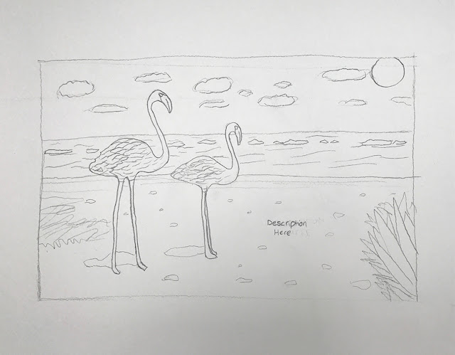
Once I had written down as many suitable things as possible, I began to cross-reference the list, to see if certain colours could be combined in one illustration. The first visual idea that came to mind was flamingos on a beach. The blue sea, yellowy sand beaches, green plantation and pink flamingos combine 4 of the 5 calming colours. Further research into flamingos highlighted that they are a symbol of the God Ra - the Sun God. As the Sun is considered to be optimistic, bringing warmth and light to others, this idea seemed appropriately positive for such a colouring book. Images of the open sea are also considered to be very relaxing (found in the research stages), therefore, this idea was developed forward. A reference image was used to create a rough illustration, which was later presented to a crit group.

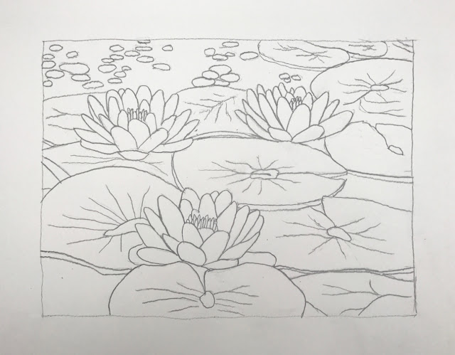
By using the same cross-referencing method, another idea was considered - water lilies. They have pink and violet petals, yellow centres and surrounding green leaves and blue water - once again combining 4 of the 5 calming colours. Further research into water lilies highlighted that they are considered to be a symbol of optimism, peace, purity and spiritual enlightenment. I have personally always found water lilies to be visually very calming because of their tranquil state and beauty. For these reasons, this idea seemed positive and appropriate for use in the colouring book. A quick illustration was also made for this idea.

Both sketches and their reasonings were presented to a small crit group, to see which idea people thought would be more calming and enjoyable to colour in. Overall, people thought the reasonings behind both ideas was strong, and that they would both be appopriate for the colouring book. When asked to pick between the two illustrations made, the majority of feedback leaned towards developing the water lily concept. People commented that the flamingo illustration is too spacious and not detailed enough to be as engaging as the water lily illustration. I agreed with this, as the water lily illustration is slightly more intricate and concentrated. For this reason, the water lily drawing was taken forward in the development process.


No comments:
Post a Comment