In response to the name FLAC I have researched into a wide variety of areas online. By doing so I have found that FLAC was created in 2001. Inspired by this, I have made a variety of initial ideas that revolve around design in the 2000s and other relevant areas.
Typography - By researching into typefaces of the 2000s, a selection were found and experimented with. Archur & Gotham were very popular typefaces created by the renown type foundry Hoefler & Co. - Gotham was particularly prominent, with its most famous use in the Obama presidential campaign. As these typefaces are fairly simple in style, further research has been made to find typefaces with more character.

256TM Type Foundry released two typefaces in the 2000s - Garaje & Minuscule 2. These are vastly different to the Hoefler & Co. typefaces, offering more freedom to experiment with. As FLAC files are preceded by a dot, experimentation was made to try and integrate dots into the type to make it more unique. Feedback has suggested that the lowercase Garaje typeface was the most popular, particularly the bottom left one created with the dot integration.
Logoshapes - Informed by the early research into logoshapes and how important they are I have made a variety of illustrations. These are all informed by FLAC or an aspect related to the 2000s.
The first logoshape produced can be seen below. This is informed by the use of black lines in rave posters and the secrecy motif behind our event. By combining the two, a lock icon was produced.
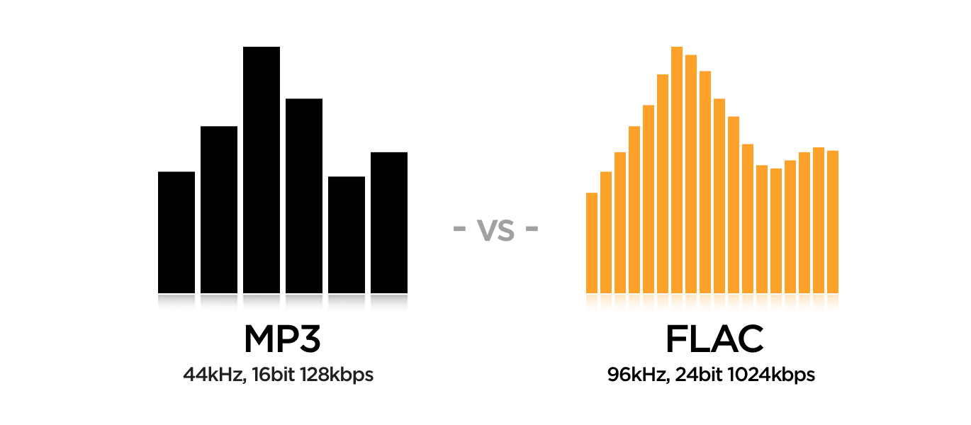
The second two logotypes produced is informed entirely by research into FLAC files. Audio sources encoded to FLAC are typically reduced to 50–60% of their original size, similar to other lossless formats, though the final size depends on the density and volume of the music being compressed, and, with some music, file size can be reduced by as much as 80%. Inspired by both statistics, two icons have been created. The first is a circle with another circle inside it, scaled at 50%. The second is a combination of 8 and 0 overlaid, linking to the 80% statistic. This visually also resembles a speaker.
The third logoshape produced can be seen below. This is informed by research into the year 2001 - when the FLAC format was created. 2001 was the year of the snake; therefore, a spiral-style icon has been made, making reference to this year.
The shape that people think links the most to a night event is the moon. This is informed by research into synthesisers, and how the Korg Triton was believed to embody the sound of the 2000s. Research into Triton highlighted that it is also the only large moon in the Solar System with a retrograde orbit, an orbit in the opposite direction to its planet's rotation. Inspired by this, the icon has been produced.
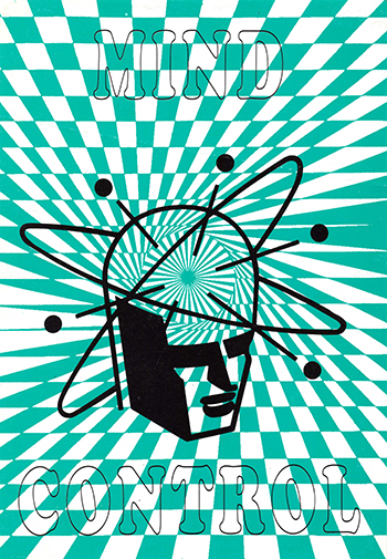
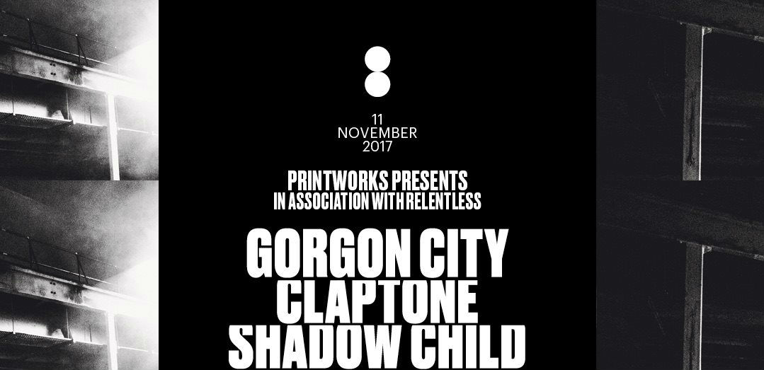
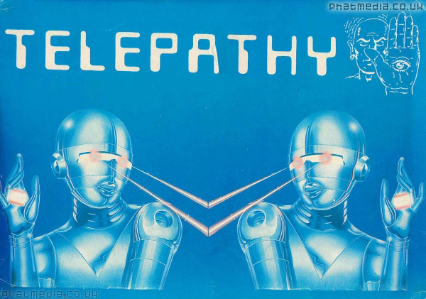
Posters - By using the Garaje typeface and moon logoshape, a variety of posters have been made. One batch of posters take reference from old rave posters, using high contrast colours, black lines and rave imagery, whilst the other uses the moon as a logoshape, with the Garaje logotype as a foreground focus.
The two poster ideas have been presented to the team and young people for feedback. The moon idea has been favoured as people think that the combination of a logotype and logoshape works really strongly to make the brand identifiable; but, it has een pointed out that the use of a moon is too similar to that of another event called Night Bass. For this reason, the moon logoshape will not been developed. Instead, the typeface has been taken forward and further experimented with to produce a final logotype and logoshape.




.jpg)

