Sleeve 1 - To develop the previous sketch made, I have drawn a face with eyes in Illustrator and repeated it in a square pattern. I then drew every smile and grimace differently. In terms of colour, yellow has been chosen for the central smiley face, inspired by the popular yellow that was used in a lot of punk designs. Furthermore, yellow is the brightest color of the visible spectrum and is a symbol of optimism.
To contrast against this, a darker colour has been chosen. It is believed that too much of the colour purple can promote or aggravate depression; therefore, for these reasons, both colours link to the idea concept very well. To add further variety to the different grimace faces and make them appear more chaotic, squiggly lines have been overlaid, which makes the yellow, positive face more distinct and clear. Feedback highlights that nothing more needs to be added to this design, as people think the two colours alone work effectively.
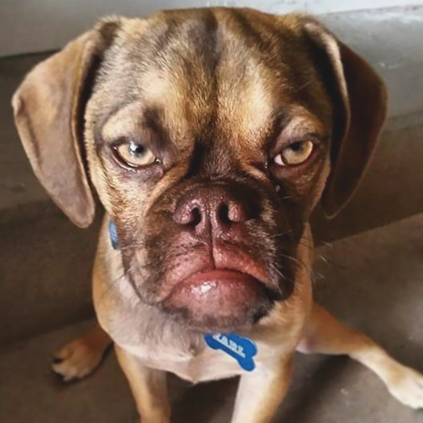
Sleeve 2 - As the term 'Black Dog' is believed to have originated from Winston Churchill, royalty free images have been looked at online to try and find a dog that represents the face of defiance - the message 'I'm Not Down' gives.
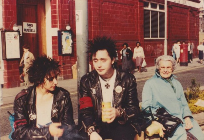
To replicate the cut-out punk newspaper style I have made the image black and white with the threshold effect. This makes the image appear as if it had been illustrated, allowing me to add certain punk fashion aspects, such as messy hair, a nose ring and a studded belt to the pug.
In terms of typography, the lyrics 'I've been beat up, I've been thrown out' have been used, as they come before the line 'I'm Not Down', the track's title and main reference to defiance. By using punk typography reference images as inspiration, various different typefaces have been used to manually replicate the style. For the colour of the artwork, experimentation with the punk combination pink, yellow and black has been made. Feedback from peers indicates that a gradient works better than block colours, purely because it allows the black dog to have a bolder focus on the sleeve.
Sleeve 3 - The final sleeve was the easiest to produce. The sketched drawing was used as a reference and digitally produced in Illustrator. To highlight the positivity of the song, a colour was chosen to use in the background. Rather than using yellow once more, green has been selected, as it has associations with balance and peace of mind. Feedback highlights that the simplicity is effective and should not be changed.


No comments:
Post a Comment